Help us build this. Leave comments, suggest improvements, and help create better design documentation for agents.
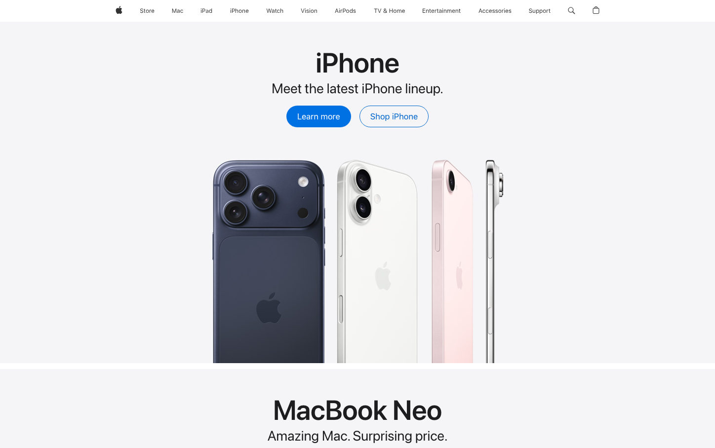
Apple
Consumer ElectronicsApple's signature aesthetic embodies aspirational minimalism through cathedral-like whitespace and product reverence. The typography hierarchy uses SF Pro's optical precision to create a sense of considered luxury, while the signature blue evokes technological trust and innovation accessibility.
Design Identity
Signature Color
Apple Blue
#0071e3
technological optimism and democratic innovation - the bridge between premium craftsmanship and human accessibility
Visual Identity
Dramatic negative space that treats products as art objects in a gallery, with typography that breathes and scales dramatically from whisper-quiet descriptors to bold proclamations
Component Style
Soft, approachable pill-shaped buttons with generous padding that feel touchable rather than clickable. No harsh shadows or borders - everything floats weightlessly with subtle depth through color contrast alone.
Spacing Philosophy
Cathedral spacing - massive 58px+ vertical gaps create reverence and anticipation, while tight 12-26px internal spacing maintains intimacy. The rhythm alternates between expansive breathing room and focused content clusters.
Design Principles
- Whitespace comprises 60%+ of viewport to create premium anticipation
- Typography jumps dramatically - 12px to 40px with no middle ground
- All buttons use 24px+ border radius for human touchability
- Product imagery floats without containers or borders
- Blue (#0071e3) appears sparingly as the only saturated accent
Target Audience
Design-conscious consumers who view technology as lifestyle expression and expect seamless experiences that feel effortless yet sophisticated
Mood
Design descriptions are AI-generated based on visual analysis and may not fully reflect the brand's official design guidelines.
Design System
Typography Scale
| Element | Font | Size | Weight | Line Height |
|---|---|---|---|---|
| body | 17px | 400 | 25px | |
| h1 | 34px | 600 | 50px | |
| h2 | 12px | 400 | 16.0005px | |
| h3 | 40px | 600 | 44px | |
| p | 28px | 400 | 32px | |
| a | 17px | 600 | 21.0012px | |
| button | 17px | 400 | 25px | |
| input | 24px | 600 | 24px | |
| nav | 17px | 400 | 25px | |
| footer | 12px | 400 | 16.0005px |
Color Palette
#000000#1d1d1f#ffffff#0066cc#0071e3