Help us build this. Leave comments, suggest improvements, and help create better design documentation for agents.
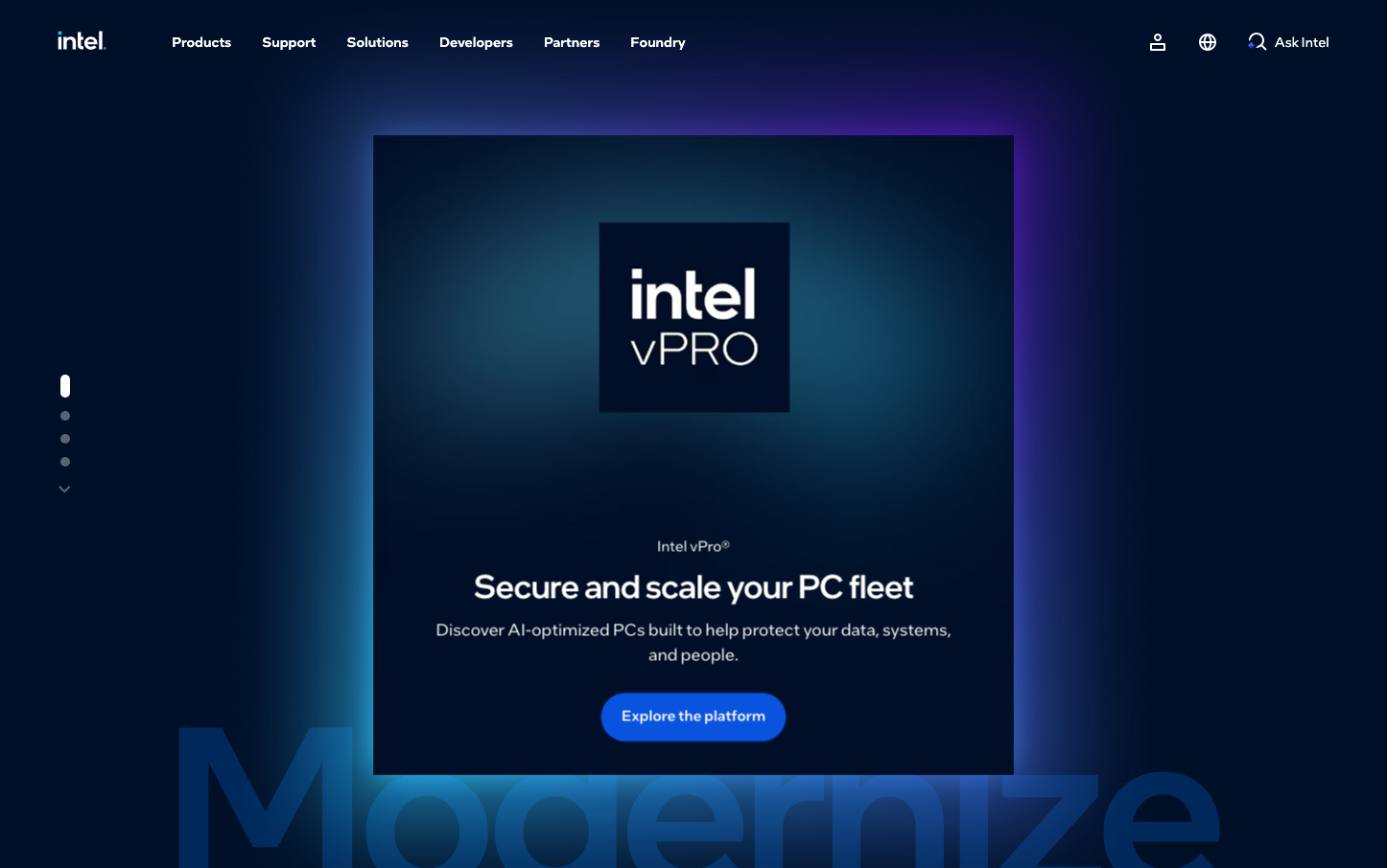
Intel
Consumer ElectronicsIntel's design exudes enterprise-grade authority through deep oceanic gradients and sophisticated cosmic aesthetics. The typography speaks in measured, institutional tones while the color palette tells a story of technological depth and professional gravitas.
Design Identity
Signature Color
Intel Classic Blue
#0068b5
enterprise trust and technological reliability
Visual Identity
Immersive gradient overlays that create atmospheric depth, transforming flat surfaces into dimensional experiences that feel both cosmic and corporate
Component Style
Softly rounded buttons with generous padding and subtle luminosity. Components feel substantial yet approachable, with moderate border radius (likely 8-12px) and glowing effects rather than harsh shadows
Spacing Philosophy
Generous breathing room with large hero sections that command attention. Strategic use of negative space creates focal hierarchy, with substantial gaps between content blocks to establish premium positioning
Design Principles
- Typography uses only Intel's proprietary fonts with 500 weight for headings
- Gradients transition from deep navy (#000f28) to vibrant blues (#00c7fd)
- Text maintains 1.5x line-height for enterprise readability
- Transitions use 250ms base timing for professional interactions
- Focus states use blue shadow overlays (#0046c81f) instead of outlines
Target Audience
IT decision makers and enterprise technology managers who value proven reliability over cutting-edge aesthetics
Mood
Design descriptions are AI-generated based on visual analysis and may not fully reflect the brand's official design guidelines.
Design System
Typography Scale
| Element | Font | Size | Weight | Line Height |
|---|---|---|---|---|
| body | 16px | 400 | 18.4px | |
| h2 | 32px | 500 | 38.4px | |
| h3 | 32px | 500 | 35.2px | |
| p | 14px | 400 | 21px | |
| a | 14px | 500 | 21px | |
| button | 16px | 400 | 16px | |
| input | 16px | 400 | 16px | |
| nav | 16px | 400 | 16px | |
| header | 16px | 400 | 18.4px | |
| footer | 16px | 400 | 18.4px |
Color Palette
#0046c8#000000#ffffff#d7d7d7#d8d8d8#0068b5#004a86#00c7fd#262626#525252#f7f7f7#6a6d75