Help us build this. Leave comments, suggest improvements, and help create better design documentation for agents.
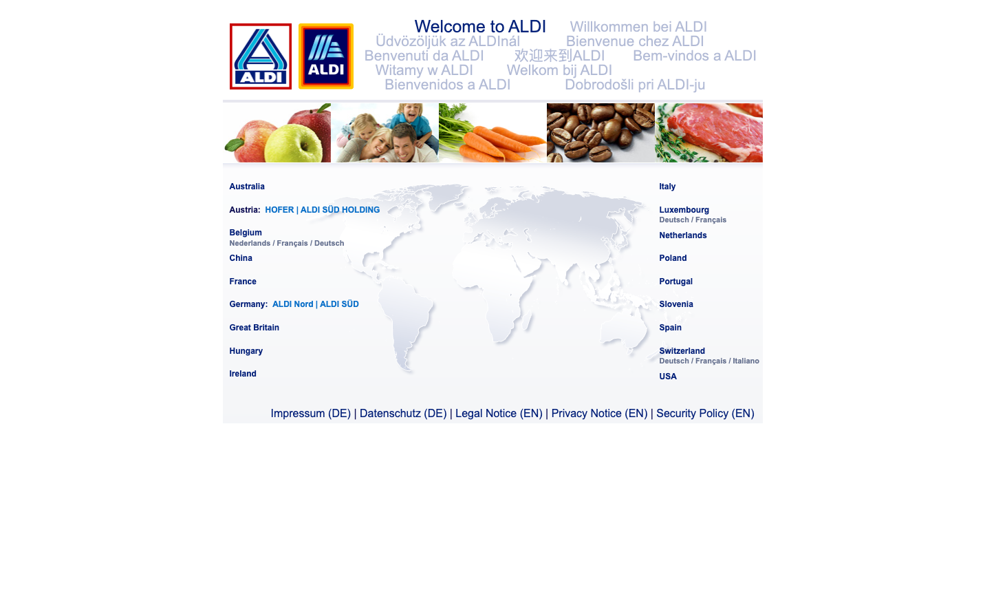
Aldi
RetailAldi's brand radiates no-frills efficiency with its industrial Arial typography and bold primary color palette. The design communicates practical affordability through stark simplicity—every element serves a functional purpose without ornamentation, creating an atmosphere of trustworthy value.
Design Identity
Signature Color
Aldi Process Blue
#0066CC
Dependable value and systematic efficiency—the blue of industrial processes made consumer-friendly
Visual Identity
The tri-color geometric logo treatment with stark Arial typography creates an instantly recognizable industrial-meets-accessible aesthetic that feels more like signage than traditional branding.
Component Style
Components embrace utilitarian brutalism—sharp corners, minimal borders, and high contrast. Links use heavy 700 weight typography with generous 33.6px line height, creating chunky, accessible touch targets that prioritize function over finesse.
Spacing Philosophy
Generous whitespace around navigation elements creates breathing room while maintaining density in content areas. The spacing feels systematic rather than luxurious—engineered for clarity rather than elegance.
Design Principles
- Typography locked to Arial system fonts only—no custom typefaces
- Link typography always 700 weight with 33.6px line height for maximum accessibility
- Body text maintains 16px baseline for optimal readability
- Headers paradoxically smaller at 14px to de-emphasize hierarchy
- Color palette limited to primary brand colors with minimal gradients
Target Audience
Budget-conscious families who value straightforward shopping experiences over premium aesthetics—people who want efficiency and transparency in their grocery retail.
Mood
Design descriptions are AI-generated based on visual analysis and may not fully reflect the brand's official design guidelines.
Design System
Typography Scale
| Element | Font | Size | Weight | Line Height |
|---|---|---|---|---|
| body | 16.0016px | 400 | normal | |
| h1 | 14px | 700 | normal | |
| p | 16.0016px | 400 | normal | |
| a | 12px | 700 | 33.6px |
Color Palette
No colors extracted