Help us build this. Leave comments, suggest improvements, and help create better design documentation for agents.
Aesop
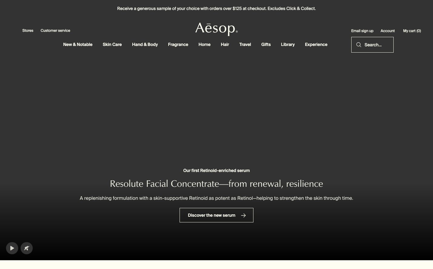
E-commerceAesop embodies sophisticated minimalism with a monochromatic palette that feels like a luxury apothecary meets contemporary gallery. The typography mixing SuisseIntl and Zapf-Humanist creates an intellectual, editorial sophistication that whispers rather than shouts.
Design Identity
Signature Color
Apothecary Black
#000000
pharmaceutical precision and timeless luxury craftsmanship
Visual Identity
Vast expanses of black space punctuated by precise white typography in mixed font families - the dramatic negative space ratio creates an unmistakably premium apothecary aesthetic.
Component Style
Stark outlined buttons with hairline borders, zero shadows, and generous internal padding - everything feels pharmaceutical and precise, like laboratory equipment rendered in typography.
Spacing Philosophy
Dramatic negative space dominance with 80% black void and minimal content clusters - creates a gallery-like reverence where every element demands contemplation.
Design Principles
- Typography never exceeds 31px to maintain intimate reading experience
- Font weights stay at 400 baseline with strategic 700 for hierarchy
- Monochromatic palette with single accent color #006680
- Navigation remains minimal with single-line horizontal layout
- Content floats in vast negative space like museum placards
Target Audience
Design-conscious professionals who value intellectual luxury and appreciate pharmaceutical-grade attention to detail over flashy marketing
Mood
Design descriptions are AI-generated based on visual analysis and may not fully reflect the brand's official design guidelines.
Design System
Typography Scale
| Element | Font | Size | Weight | Line Height |
|---|---|---|---|---|
| body | 12px | 400 | 18px | |
| h1 | 30px | 400 | 39.9px | |
| h2 | 31px | 400 | 41.23px | |
| h3 | 15.84px | 700 | 22.176px | |
| p | 14px | 400 | 21px | |
| a | 12px | 400 | 18px | |
| button | 12px | 400 | normal | |
| input | 24px | 400 | normal | |
| nav | 12px | 400 | 18px | |
| header | 12px | 400 | 18px |
Color Palette
#006680