Help us build this. Leave comments, suggest improvements, and help create better design documentation for agents.
Zopa
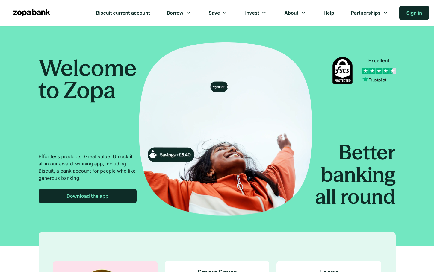
FintechZopa's brand exudes optimistic financial empowerment through its vibrant mint-green palette that feels fresh and approachable rather than sterile. The custom seasonMix typeface creates bold, rounded headlines that contrast beautifully with clean Inter body text, establishing a personality that's both trustworthy and energetic.
Design Identity
Signature Color
Zopa Mint
#7DDCC0
growth-focused financial optimism - fresh, trustworthy, and distinctly non-corporate
Visual Identity
The organic, rounded bubble compositions containing lifestyle photography create an unmistakable visual system that breaks away from traditional fintech rectangles and grids.
Component Style
Buttons feature generous rounded corners (8-12px) with solid fills and no shadows, maintaining a clean, approachable feel. The dark green primary button contrasts boldly against the mint background while feeling part of the same family.
Spacing Philosophy
Expansive breathing room with large sections of pure mint background, allowing hero elements to float freely. The circular photo treatment creates natural negative space that feels organic rather than grid-locked.
Design Principles
- Headlines use custom seasonMix at 76px for maximum impact
- Body text exclusively uses Inter at 16px for readability
- Circular photography containers create organic, non-corporate layouts
- Mint green dominates backgrounds with strategic dark green accents
- Interface notifications use rounded pills with subtle shadows
Target Audience
Millennials and Gen-Z who want banking that feels like a lifestyle brand rather than a traditional financial institution - people who value transparency and modern experiences over legacy prestige.
Mood
Design descriptions are AI-generated based on visual analysis and may not fully reflect the brand's official design guidelines.
Design System
Typography Scale
| Element | Font | Size | Weight | Line Height |
|---|---|---|---|---|
| body | 16px | 400 | 24px | |
| h1 | 76px | 600 | 74px | |
| h2 | 18px | 600 | 26px | |
| h3 | 18px | 600 | 26px | |
| p | 16px | 400 | 24px | |
| a | 16px | 400 | 16px | |
| button | 16px | 400 | 24px | |
| nav | 16px | 400 | 24px | |
| header | 16px | 400 | 24px | |
| footer | 16px | 400 | 24px |
Color Palette
#ffffff