Help us build this. Leave comments, suggest improvements, and help create better design documentation for agents.
Zerodha
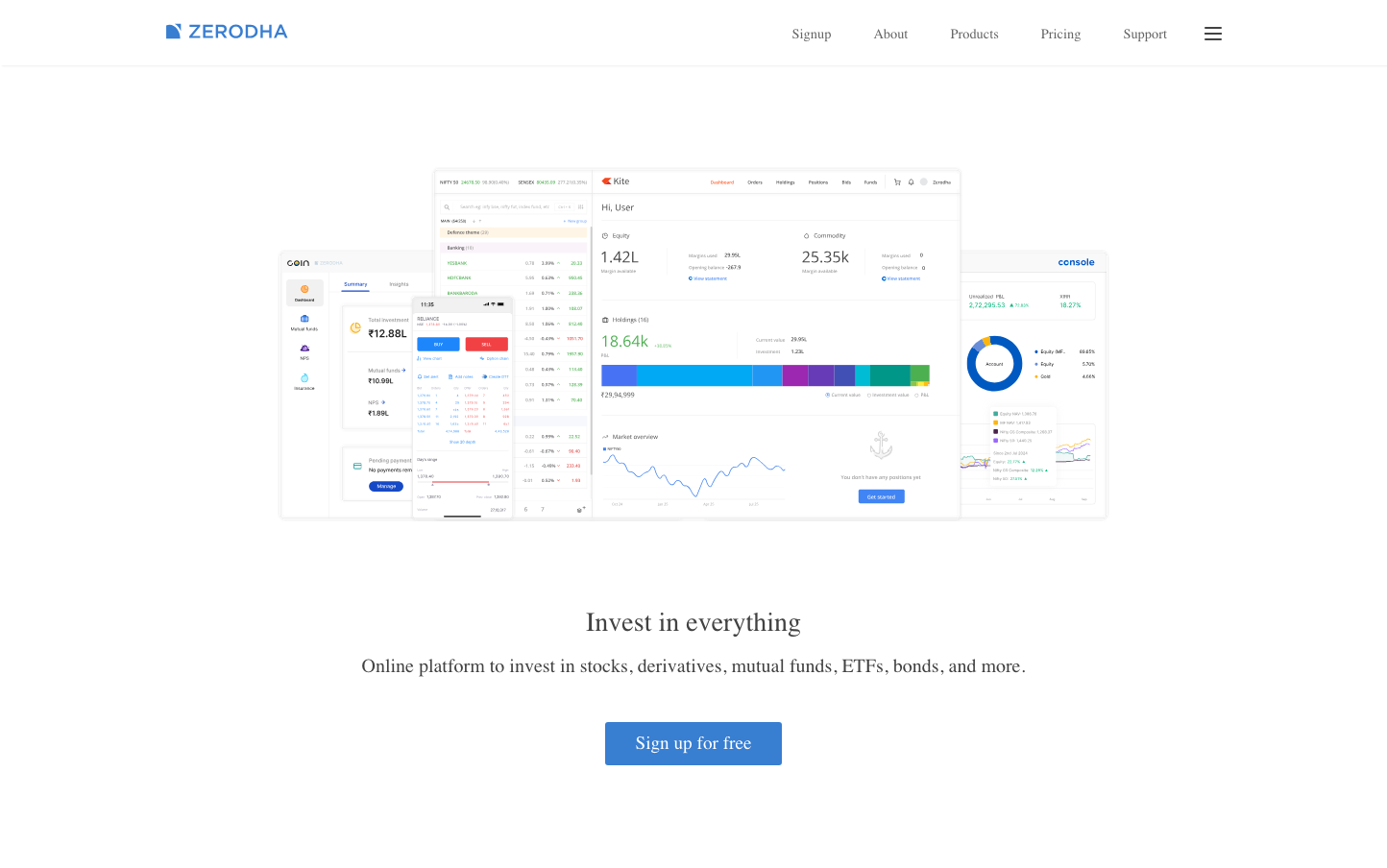
FintechZerodha embodies data-dense transparency with a dashboard-first aesthetic that mirrors professional trading terminals. The typography is deliberately understated with consistent Inter Medium weights, creating a trustworthy, no-nonsense atmosphere that prioritizes information clarity over visual flourish.
Design Identity
Signature Color
Zerodha Blue
#387ED1
Financial reliability and data-driven precision - the color of trusted market information
Visual Identity
Multi-panel dashboard layout with dense information architecture, featuring real-time data widgets, performance charts, and numerical emphasis that resembles professional trading software
Component Style
Cards with subtle shadows and minimal 4-6px border radius, creating floating panel effects. Components feel dense but organized, with emphasis on data tables, metrics, and chart visualizations rather than decorative elements
Spacing Philosophy
Efficient spacing that maximizes information density - tight 8-12px internal padding with 16-24px gaps between major sections. Space serves data presentation rather than visual breathing room
Design Principles
- Information density over whitespace - every pixel serves data
- Border radius consistently under 8px for professional appearance
- Typography weights limited to 400 and 500 for hierarchy without drama
- Charts and numerical data take visual priority over marketing copy
- Color used functionally for data states rather than brand expression
Target Audience
Serious retail investors and active traders who prioritize comprehensive market data and analytical tools over simplified interfaces
Mood
Design descriptions are AI-generated based on visual analysis and may not fully reflect the brand's official design guidelines.
Design System
Typography Scale
| Element | Font | Size | Weight | Line Height |
|---|---|---|---|---|
| body | 16px | 400 | 27.2px | |
| h1 | 28px | 500 | 35px | |
| h2 | 24px | 500 | 36px | |
| h3 | 20px | 500 | 32px | |
| p | 16px | 400 | 28.8px | |
| a | 16px | 400 | 27.2px | |
| nav | 16px | 400 | 27.2px | |
| footer | 16px | 400 | 27.2px | |
| main | 16px | 400 | 27.2px |
Color Palette
No colors extracted