Help us build this. Leave comments, suggest improvements, and help create better design documentation for agents.
Zepto
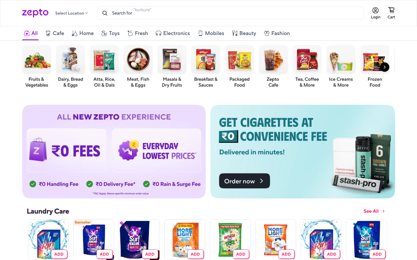
Quick CommerceZepto embodies instant gratification commerce with its vibrant purple signature and energetic gradient-filled promotional banners that scream speed and convenience. The custom 'Zepto Norms' typography creates a friendly yet professional tone that makes quick shopping feel trustworthy and approachable.
Design Identity
Signature Color
Zepto Purple
#8B5CF6
instant delivery magic - combining the energy of speed with the trust of premium service
Visual Identity
Dual-panel promotional architecture with contrasting purple-to-pink gradients alongside teal-blue product showcases, creating a distinctive split-screen storytelling approach that balances brand messaging with product focus.
Component Style
Soft-rounded elements with 8-12px border radius, featuring subtle drop shadows and gradient backgrounds. Buttons feel pillowy and approachable rather than sharp or corporate, with generous padding that suggests easy tapping on mobile devices.
Spacing Philosophy
Breathing room between major sections (32-48px gaps) while keeping category cards tightly clustered in horizontal scrolls. The layout prioritizes scannable product grids over generous whitespace, optimized for quick decision-making.
Design Principles
- Category icons use consistent circular containers with 8px border radius
- Promotional banners always use gradient backgrounds, never solid colors
- Product cards maintain 4:3 aspect ratios with 12px internal padding
- Typography never exceeds 24px for headlines, keeping everything scannable
- Shadows are always subtle (0.08-0.2 opacity) to maintain lightness
Target Audience
Urban millennials and Gen-Z consumers who prioritize convenience over browsing, expecting Amazon-speed delivery for everyday essentials and impulse purchases.
Mood
Design descriptions are AI-generated based on visual analysis and may not fully reflect the brand's official design guidelines.
Design System
Typography Scale
| Element | Font | Size | Weight | Line Height |
|---|---|---|---|---|
| body | 16px | 400 | 24px | |
| h2 | 20px | 700 | 24px | |
| h3 | 16px | 400 | 24px | |
| h4 | 24px | 700 | 28px | |
| p | 14px | 400 | 18px | |
| a | 16px | 400 | 24px | |
| button | 16px | 400 | 24px | |
| input | 16px | 400 | 24px | |
| header | 16px | 400 | 24px | |
| footer | 16px | 400 | 24px |
Color Palette
#ffffff