Help us build this. Leave comments, suggest improvements, and help create better design documentation for agents.
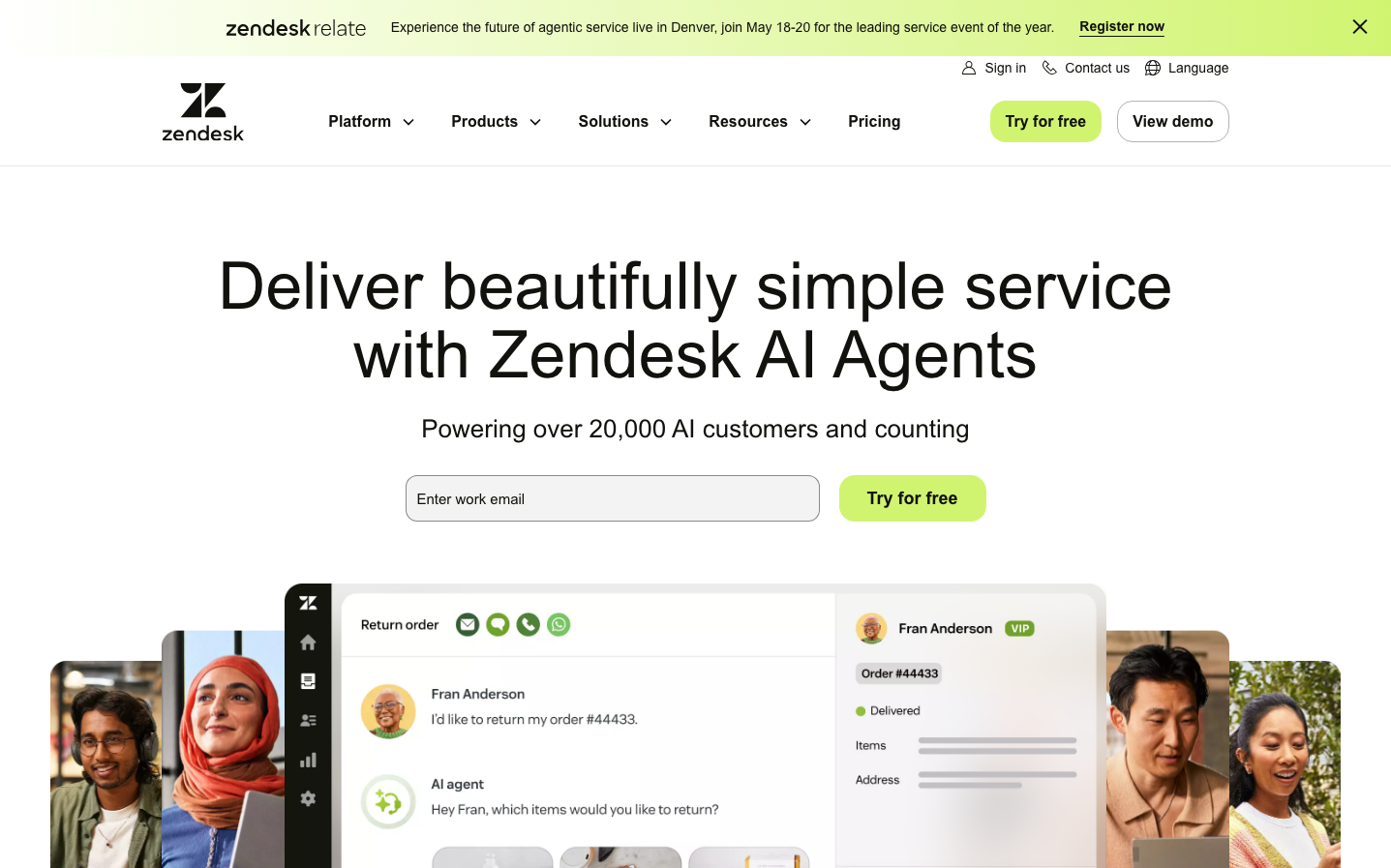
Zendesk
CommunicationZendesk projects approachable enterprise sophistication through its signature lime-green energy balanced with clean, spacious layouts. The custom 'Vanilla Sans' typography creates a friendly yet professional voice that feels both human and scalable, perfectly embodying their customer service automation mission.
Design Identity
Signature Color
Zendesk Lime
#A4D65E
Growth-oriented customer service energy - fresh, optimistic, and approachable enough for human interaction yet vibrant enough for AI innovation
Visual Identity
The generous use of lime-green as the primary action color combined with the distinctive Vanilla Sans typography at large scales creates an instantly recognizable warmth-meets-efficiency aesthetic that stands apart from typical enterprise blue palettes.
Component Style
Smoothly rounded components with 20px border radius create approachable, pill-like buttons that feel friendly rather than corporate. Clean backgrounds with subtle borders, no heavy shadows - everything feels accessible and human-centered rather than intimidatingly technical.
Spacing Philosophy
Luxuriously airy with 88px section padding and 64px content margins that create breathing room for complex enterprise messaging, while tighter 8-16px text margins maintain readability hierarchy within content blocks.
Design Principles
- Border radius consistently uses 20px for friendly, approachable feel
- Typography scale jumps dramatically from 16px body to 68px headlines for maximum impact
- Lime green (#A4D65E) reserved exclusively for primary actions and key highlights
- 88px section padding creates enterprise-level spaciousness
- Vanilla Sans at 500-600 weight maintains readability while feeling custom and branded
Target Audience
Customer service managers and enterprise decision-makers who want AI automation that feels human-friendly rather than cold and robotic - people who value approachable technology that scales.
Mood
Design descriptions are AI-generated based on visual analysis and may not fully reflect the brand's official design guidelines.
Design System
Typography Scale
| Element | Font | Size | Weight | Line Height |
|---|---|---|---|---|
| body | 16px | 400 | 16px | |
| h1 | 68px | 500 | 71.4px | |
| h2 | 18px | 600 | 26.1px | |
| h3 | 26px | 500 | 32.5px | |
| h5 | 16px | 600 | 23.2px | |
| p | 14px | 400 | 19.6px | |
| a | 18px | 500 | 18px | |
| button | 16px | 600 | 23px | |
| input | 15px | 400 | 21px | |
| nav | 16px | 400 | 16px |
Color Palette
No colors extracted