Help us build this. Leave comments, suggest improvements, and help create better design documentation for agents.
Yoco
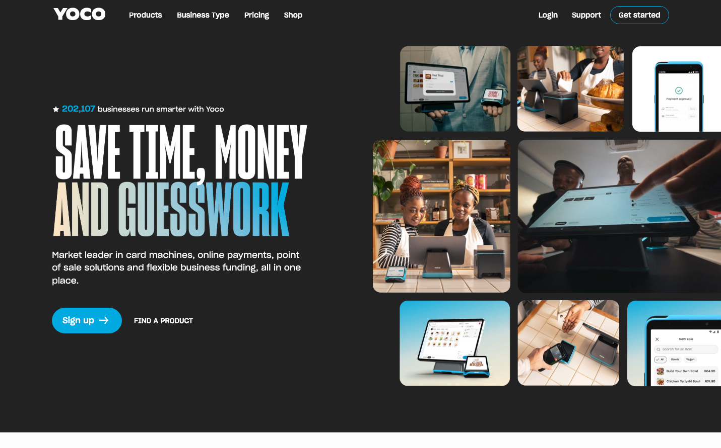
FintechYoco presents a warm, approachable fintech aesthetic that breaks the cold corporate mold through its distinctive cream-and-charcoal contrast. The Sharp Grotesk typography creates friendly authority while the grid of warm photography showcases real businesses, making payment technology feel human and accessible.
Design Identity
Signature Color
Yoco Teal
#00B8D4
approachable fintech trust - modern yet warm, suggesting reliability without intimidation
Visual Identity
The asymmetrical mosaic of warm, candid business photography against dark backgrounds creates an instantly recognizable grid pattern that humanizes payment technology.
Component Style
Generously rounded buttons with substantial padding feel approachable and tactile. The primary CTA uses a vibrant teal with soft pill-shaped corners, while secondary actions remain understated with simple text treatments.
Spacing Philosophy
Luxurious negative space on the left balances the dense photo grid on the right, creating breathing room for the bold typography while maintaining visual interest through the organized chaos of real business imagery.
Design Principles
- Typography never exceeds 72px for maximum impact without overwhelming
- Photography always shows real people in authentic business settings
- Teal accent color is reserved for primary actions only
- Dark backgrounds create dramatic contrast with warm imagery
- Button border radius consistently uses pill-shaped 24px+ curves
Target Audience
Small business owners and entrepreneurs who want sophisticated payment solutions but are intimidated by complex fintech interfaces
Mood
Design descriptions are AI-generated based on visual analysis and may not fully reflect the brand's official design guidelines.
Design System
Typography Scale
| Element | Font | Size | Weight | Line Height |
|---|---|---|---|---|
| body | 14px | 400 | 21px | |
| h1 | 72.24px | 500 | 79.464px | |
| h2 | 41.804px | 500 | 52.255px | |
| h3 | 50.162px | 500 | 60.1944px | |
| p | 9.716px | 400 | 14.574px | |
| a | 14px | 400 | 21px | |
| button | 14px | 400 | 21px | |
| input | 14px | 400 | 21px | |
| footer | 14px | 400 | 21px | |
| main | 14px | 400 | 21px |
Color Palette
#007aff#3b82f6#ffffff