Help us build this. Leave comments, suggest improvements, and help create better design documentation for agents.
Xendit
FintechXendit presents a bold, globally-minded fintech identity that balances corporate authority with accessibility. The gradient sky-to-ocean backdrop creates an aspirational, borderless feeling that mirrors their cross-border payment mission, while the massive bold typography commands attention without intimidation.
Design Identity
Signature Color
Xendit Sapphire
#4285F4
International trust and digital connectivity - suggesting both sky-high ambition and ocean-deep reliability
Visual Identity
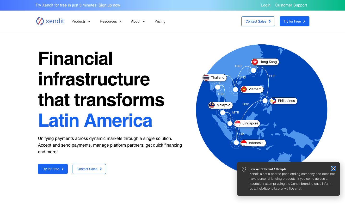
The distinctive blue gradient sphere world map with floating country labels creates an instantly recognizable 'global command center' aesthetic that no other fintech uses.
Component Style
Clean geometric buttons with 6px rounded corners and subtle depth. No harsh shadows or borders - everything feels approachable yet substantial, with solid fills rather than outlines dominating the interface.
Spacing Philosophy
Asymmetric layout with generous left-side breathing room (200px+) for typography, while the right side densely packs the interactive globe. Vertical rhythm follows 32px increments with tight 16px gaps between related elements.
Design Principles
- Headlines never exceed 76px and always use 700 weight for maximum impact
- Blue gradient backgrounds transition from #6366F1 to #3B82F6 across 45-degree angle
- Interactive elements maintain 6-8px border radius consistently
- Typography hierarchy jumps dramatically: 76px headlines, 18px body, 13px details
- Geographic visualization always uses white connection lines on blue backgrounds
Target Audience
Finance directors and payment managers at mid-market companies expanding into Southeast Asian markets who need sophisticated solutions but lack technical payment expertise
Mood
Design descriptions are AI-generated based on visual analysis and may not fully reflect the brand's official design guidelines.
Design System
Typography Scale
| Element | Font | Size | Weight | Line Height |
|---|---|---|---|---|
| body | 18px | 400 | 27px | |
| h1 | 76px | 700 | 86px | |
| h2 | 13px | 500 | 19px | |
| h3 | 26px | 700 | 36px | |
| h5 | 18px | 700 | 28px | |
| p | 13px | 400 | 19px | |
| a | 18px | 400 | 27px | |
| nav | 18px | 400 | 27px |
Color Palette
#3b82f6#ffffff


