Help us build this. Leave comments, suggest improvements, and help create better design documentation for agents.
Workable
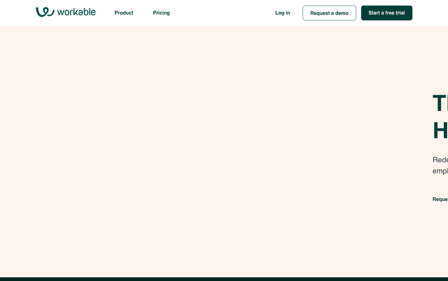
HR TechWorkable presents a bold, typography-first approach with massive scale headlines that dominate the space, creating an almost editorial magazine aesthetic. The warm beige backdrop paired with deep forest green accents communicates approachable professionalism - less corporate sterile, more human-centered recruiting.
Design Identity
Signature Color
Workable Forest
#1B5E20
Growth-focused reliability - suggesting organic talent cultivation rather than mechanical hiring processes
Visual Identity
Extreme typographic hierarchy with 72px headlines that dwarf everything else, set against warm neutral backgrounds - instantly recognizable by the dramatic scale contrast and editorial-like composition.
Component Style
Rounded-corner buttons with substantial padding, clean borders without heavy shadows. Components feel substantial but approachable - like friendly professional handshakes rather than rigid corporate interactions.
Spacing Philosophy
Generous breathing room around hero typography with substantial whitespace creating focus, while navigation and UI elements remain compact and efficient - prioritizing content hierarchy over interface density.
Design Principles
- Typography scale jumps dramatically: 72px headlines, 20px body, 14px details
- Border radius consistently moderate around 6-8px for approachability
- Forest green (#1B5E20) exclusively for primary actions and emphasis
- Warm beige backgrounds create softer alternative to stark white
- Line heights generous: 88px for 72px headlines maintains readability at scale
Target Audience
HR directors and talent acquisition managers at mid-to-large companies who want powerful recruiting tools that don't intimidate candidates or hiring teams
Mood
Design descriptions are AI-generated based on visual analysis and may not fully reflect the brand's official design guidelines.
Design System
Typography Scale
| Element | Font | Size | Weight | Line Height |
|---|---|---|---|---|
| body | 20px | 400 | 24px | |
| h1 | 72px | 700 | 88px | |
| h2 | 56px | 700 | 64px | |
| h3 | 32px | 700 | 36px | |
| p | 14px | 400 | 24px | |
| a | 14px | 400 | 24px | |
| button | 20px | 400 | 24px | |
| nav | 20px | 400 | 24px | |
| header | 20px | 400 | 24px | |
| footer | 20px | 400 | 24px |
Color Palette
No colors extracted