Help us build this. Leave comments, suggest improvements, and help create better design documentation for agents.
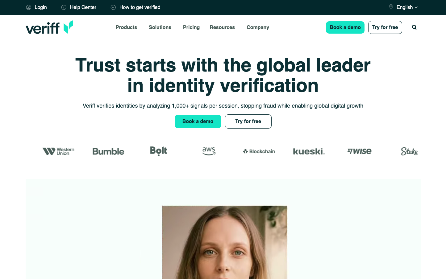
Veriff
IdentityVeriff creates a stark, minimalist aesthetic that feels like premium fintech software with surgical precision. The vibrant turquoise signature color creates electric contrast against pure whites and deep charcoals, while Inter typography maintains clinical readability. The brand radiates enterprise-grade trust through generous whitespace and confident, unadorned component design.
Design Identity
Signature Color
Veriff Turquoise
#00d084
digital trust and verification authority - suggests both technological precision and financial security
Visual Identity
Extreme contrast between brilliant turquoise CTAs and stark white backgrounds with massive typographic hierarchy - the brand is instantly recognizable by its fearless use of whitespace and electric accent color that never competes with secondary elements.
Component Style
Crisp rectangular buttons with generous padding and no visible borders or shadows - everything feels weightless yet substantial. The turquoise primary buttons appear to float against pure white backgrounds, while secondary buttons maintain subtle gray outlines. Form elements are clean and borderless with internal padding that breathes.
Spacing Philosophy
Luxurious vertical rhythm with 80px+ section breaks that create cathedral-like breathing room. The hero section uses massive 120px+ top/bottom padding while component internal spacing stays tight at 12-16px to maintain density where it matters.
Design Principles
- Border radius consistently at 8px for all interactive elements
- Typography hierarchy jumps dramatically: 18px body to 60px headlines
- CTAs always use the signature turquoise with white text
- No decorative shadows or gradients - everything is flat and confident
- Logo lockups maintain 40px minimum clear space
Target Audience
Enterprise security officers and compliance teams at fintech companies who prioritize regulatory adherence over flashy features
Mood
Design descriptions are AI-generated based on visual analysis and may not fully reflect the brand's official design guidelines.
Design System
Typography Scale
| Element | Font | Size | Weight | Line Height |
|---|---|---|---|---|
| body | 18px | 400 | 24px | |
| h1 | 60px | 700 | 66px | |
| h2 | 52px | 700 | 60px | |
| h3 | 20px | 600 | 28px | |
| p | 18px | 400 | 24px | |
| a | 18px | 400 | 30px | |
| button | 32px | 400 | 44px | |
| input | 16px | 500 | 24px | |
| nav | 18px | 400 | 24px | |
| header | 18px | 400 | 24px |
Color Palette
#e02006#7a00df#007cba#006ba1#005a87#000000#abb8c3#ffffff#f78da7#cf2e2e#ff6900#fcb900