Help us build this. Leave comments, suggest improvements, and help create better design documentation for agents.
Vercel
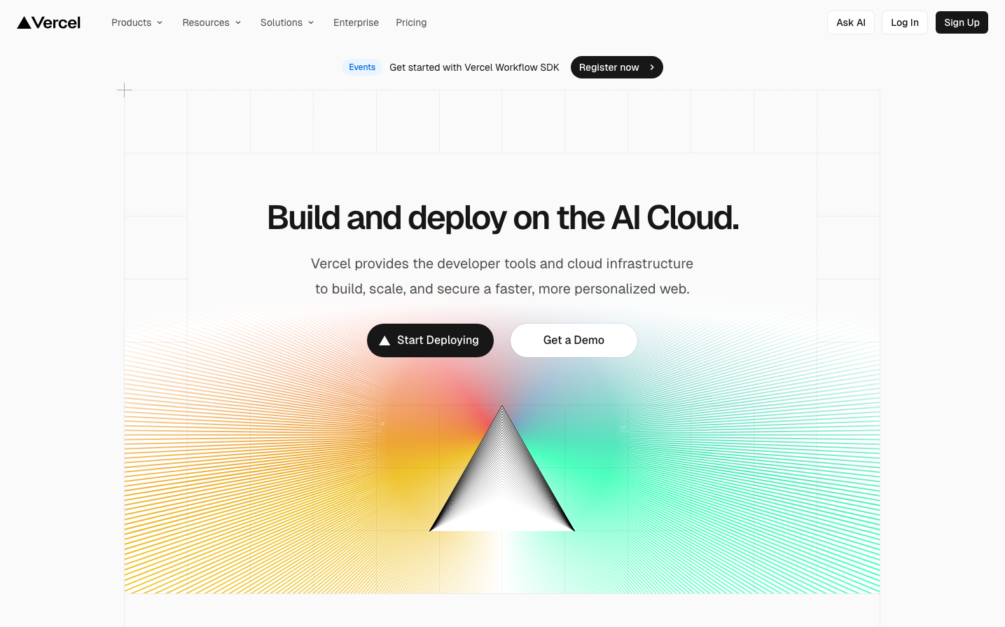
Dev ToolsVercel's brand radiates technical precision through stark black and white contrasts, softened by ethereal gradient waves that suggest infinite possibility. The Geist typeface delivers developer-focused clarity while the vibrant orange-to-teal gradient backdrop creates an optimistic, forward-moving energy that transforms deployment from mundane to magical.
Design Identity
Signature Color
Vercel Black
#000000
Absolute precision and developer-focused minimalism - the confidence of zero ambiguity
Visual Identity
The signature triangular logo floating over flowing gradient waves with mathematical line patterns - instantly recognizable through the contrast of geometric precision against organic, aurora-like color flows.
Component Style
Razor-sharp rectangular buttons with 6px corner radius, stark black backgrounds, and crisp white text. No shadows or borders - just pure contrast and confident simplicity. Everything feels precise and intentional, like developer tools should.
Spacing Philosophy
Generous 64px breathing room around hero content creates premium feel, while consistent 24px gaps maintain rhythm. The layout uses dramatic negative space to let the gradient artwork dominate, then tight 16px spacing for UI precision.
Design Principles
- Border radius locked at 6px maximum for subtle softness
- Typography uses only Geist family with 3 core weights: 400, 500, 600
- Spacing follows 4px base unit with specific tokens: 8px, 16px, 24px, 32px, 64px
- Color palette is binary: pure black (#000000) and white, with gradient accents only
- Shadows are ultra-subtle with alpha values never exceeding 0.1
Target Audience
Senior frontend developers and engineering leaders who deploy at scale and value tools that get out of their way
Mood
Design descriptions are AI-generated based on visual analysis and may not fully reflect the brand's official design guidelines.
Design System
Typography Scale
| Element | Font | Size | Weight | Line Height |
|---|---|---|---|---|
| body | 16px | 400 | normal | |
| h1 | 48px | 600 | 48px | |
| h2 | 14px | 500 | 20px | |
| h3 | 32px | 600 | 40px | |
| h5 | 14px | 400 | 20px | |
| p | 12px | 400 | 16px | |
| a | 16px | 400 | normal | |
| button | 14px | 400 | 14px | |
| input | 13.3333px | 400 | normal | |
| nav | 16px | 400 | normal |
Color Palette
#000000#93c5fd#0070f3#7928ca#ffffff#eb367f