Help us build this. Leave comments, suggest improvements, and help create better design documentation for agents.
Urban Company
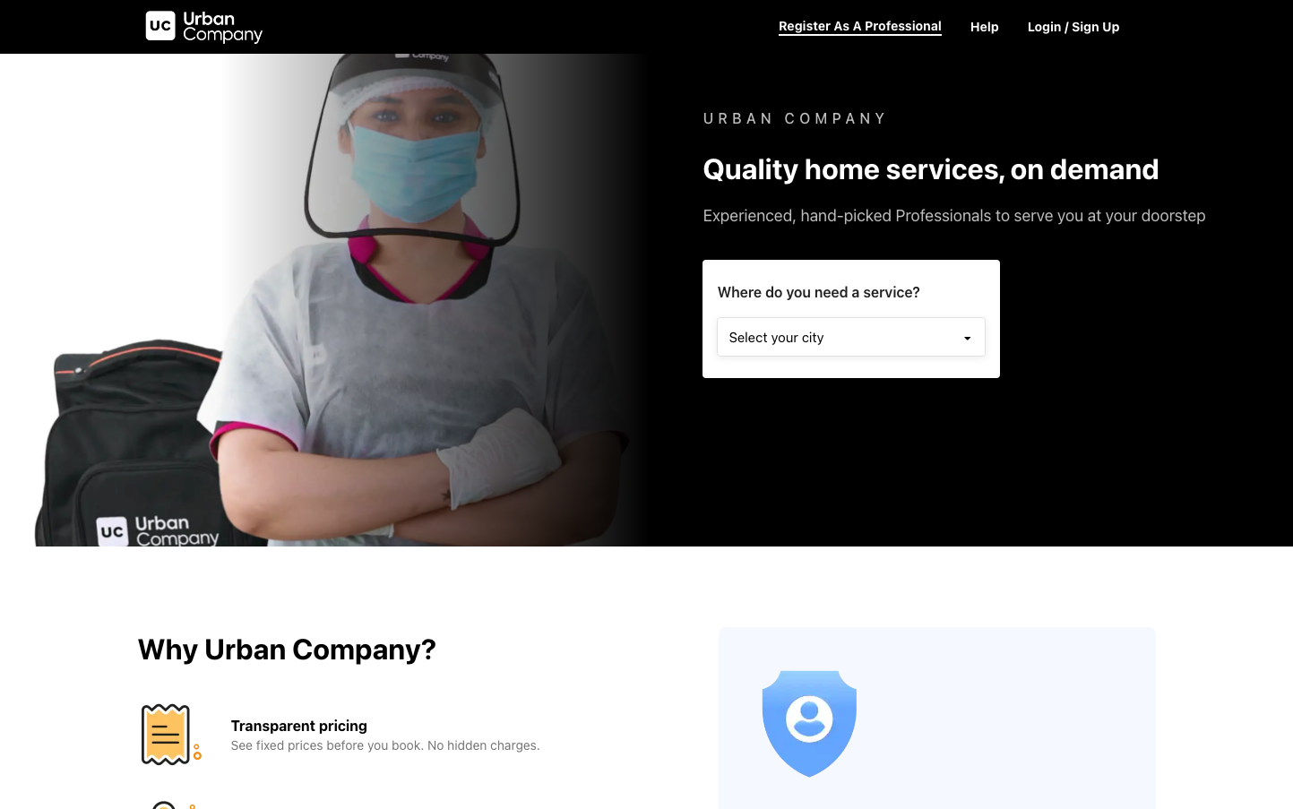
ServicesUrban Company embodies professional healthcare-meets-technology with a stark black backdrop that commands trust and sophistication. The typography hierarchy uses system fonts to feel familiar yet authoritative, while the composition balances human warmth (masked service professional) with digital efficiency (clean forms and structured layout).
Design Identity
Signature Color
Professional Black
#000000
premium service reliability and medical-grade professionalism
Visual Identity
Dramatic black backgrounds with high-contrast white text, paired with real human imagery of masked service professionals - creating an unmistakable 'premium services in the digital age' aesthetic
Component Style
Clean, minimal components with subtle borders and generous padding. Forms feel spacious and approachable with rounded corners around 8px. No heavy shadows - everything relies on contrast and whitespace for definition, creating a medical-clean but approachable interface.
Spacing Philosophy
Generous whitespace creates breathing room between major sections, while tighter internal spacing keeps related elements cohesive. The layout uses asymmetrical composition with the hero image taking roughly 60% width, leaving structured form areas with ample padding.
Design Principles
- High contrast black/white color scheme for maximum readability
- System font stack for universal accessibility and familiarity
- 32px headlines with 700 weight for strong hierarchy
- 18px body text for comfortable reading
- Rounded corners never exceed 8-12px for approachable professionalism
Target Audience
Urban professionals aged 25-45 who value convenience and quality, seeking reliable home services with the assurance of vetted professionals
Mood
Design descriptions are AI-generated based on visual analysis and may not fully reflect the brand's official design guidelines.
Design System
Typography Scale
| Element | Font | Size | Weight | Line Height |
|---|---|---|---|---|
| body | 16px | 400 | normal | |
| h1 | 32px | 700 | 48px | |
| h2 | 32px | 700 | 48px | |
| h3 | 16px | 700 | 24px | |
| p | 18px | 400 | 25.92px | |
| a | 30.4px | 400 | normal | |
| button | 12px | 600 | 13.8px | |
| input | 16px | 400 | 18.4px | |
| header | 16px | 400 | normal | |
| footer | 16px | 400 | normal |
Color Palette
No colors extracted


