Help us build this. Leave comments, suggest improvements, and help create better design documentation for agents.
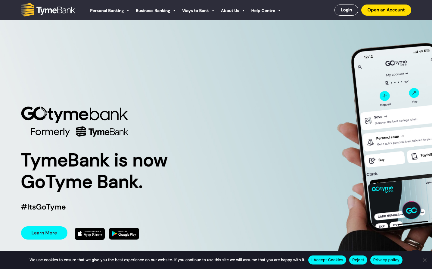
TymeBank
NeobankTymeBank's rebrand to GoTyme Bank showcases a vibrant electric cyan signature color that screams digital innovation and youthful energy. The design balances bold, futuristic elements with approachable rounded corners, creating a fintech aesthetic that feels both cutting-edge and accessible to everyday users.
Design Identity
Signature Color
GoTyme Electric Cyan
#00FFFF
Digital transformation and next-generation banking innovation
Visual Identity
The electric cyan accent color combined with bold black typography on clean white backgrounds, enhanced by generous breathing room and the distinctive curved mobile phone mockup showcasing the app interface.
Component Style
Buttons feature generous rounded corners (approximately 24px radius) with vibrant cyan fills and clean white text. The design favors soft, approachable curves over sharp edges, with subtle shadows and plenty of internal padding creating a friendly, touchable aesthetic.
Spacing Philosophy
Extremely generous whitespace dominates the layout with large 80px+ gaps between major sections. The left-aligned content occupies roughly 40% of the viewport width, leaving massive breathing room that creates a sense of premium simplicity and focus.
Design Principles
- Electric cyan (#00FFFF) is the primary brand accent, used sparingly for maximum impact
- Typography mixing: DMSans for body text, Larken Bold for impactful headings
- Rounded corners everywhere - buttons use 24px+ radius for approachability
- Asymmetrical layout with content left-aligned, mobile mockup right-aligned
- Hashtag integration (#ItsGoTyme) as a core brand element
Target Audience
Digital-native millennials and Gen Z users who want modern banking without traditional bank stuffiness - people who value convenience, technology, and brand personality over institutional gravitas.
Mood
Design descriptions are AI-generated based on visual analysis and may not fully reflect the brand's official design guidelines.
Design System
Typography Scale
| Element | Font | Size | Weight | Line Height |
|---|---|---|---|---|
| body | 16px | 400 | 24px | |
| h1 | 60px | 700 | 72px | |
| h3 | 40px | 500 | 48px | |
| h4 | 15px | 400 | 18px | |
| h5 | 24px | 500 | 28.8px | |
| h6 | 16px | 500 | 19.2px | |
| p | 15px | 400 | 25.5px | |
| a | 16px | 400 | 24px | |
| button | 13px | 400 | 40px | |
| nav | 16px | 400 | 24px |
Color Palette
#7a00df#007cba#006ba1#005a87#000000#abb8c3#ffffff#f78da7#cf2e2e#ff6900#fcb900#7bdcb5