Help us build this. Leave comments, suggest improvements, and help create better design documentation for agents.
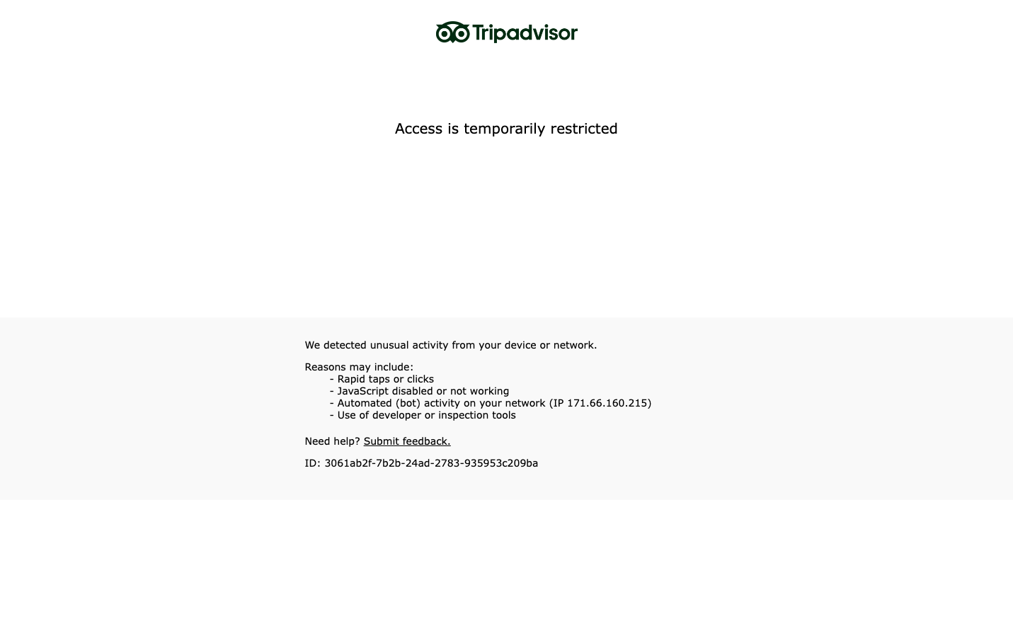
Tripadvisor
TravelTripadvisor employs a stark, utilitarian aesthetic that prioritizes function over form with clinical precision. The monochromatic palette and Times serif typography create an unexpectedly serious, almost governmental tone that contrasts sharply with typical travel brand exuberance.
Design Identity
Signature Color
Institutional Black
#000000
authoritative control and system-level seriousness
Visual Identity
Extreme minimalism with vast white space and tiny centered text blocks that feel more like system notifications than marketing content
Component Style
Ultra-sparse text-only interface with no visible buttons, borders, or interactive elements - everything feels like pure information architecture
Spacing Philosophy
Extreme negative space dominance with content occupying less than 10% of viewport - creates institutional gravity through emptiness
Design Principles
- Content never exceeds 600px width regardless of screen size
- Vertical spacing uses massive gaps of 100px+ between sections
- Typography limited to single size around 16px
- Zero decorative elements or visual embellishments
- Monochromatic palette with no accent colors
Target Audience
Enterprise IT administrators and compliance officers who need factual system status over user experience
Mood
Design descriptions are AI-generated based on visual analysis and may not fully reflect the brand's official design guidelines.
Design System
Typography Scale
| Element | Font | Size | Weight | Line Height |
|---|---|---|---|---|
| body | 16px | 400 | normal | |
| body | 16px | 400 | normal |
Color Palette
No colors extracted
UI Elements
No components detected