Help us build this. Leave comments, suggest improvements, and help create better design documentation for agents.
Toast
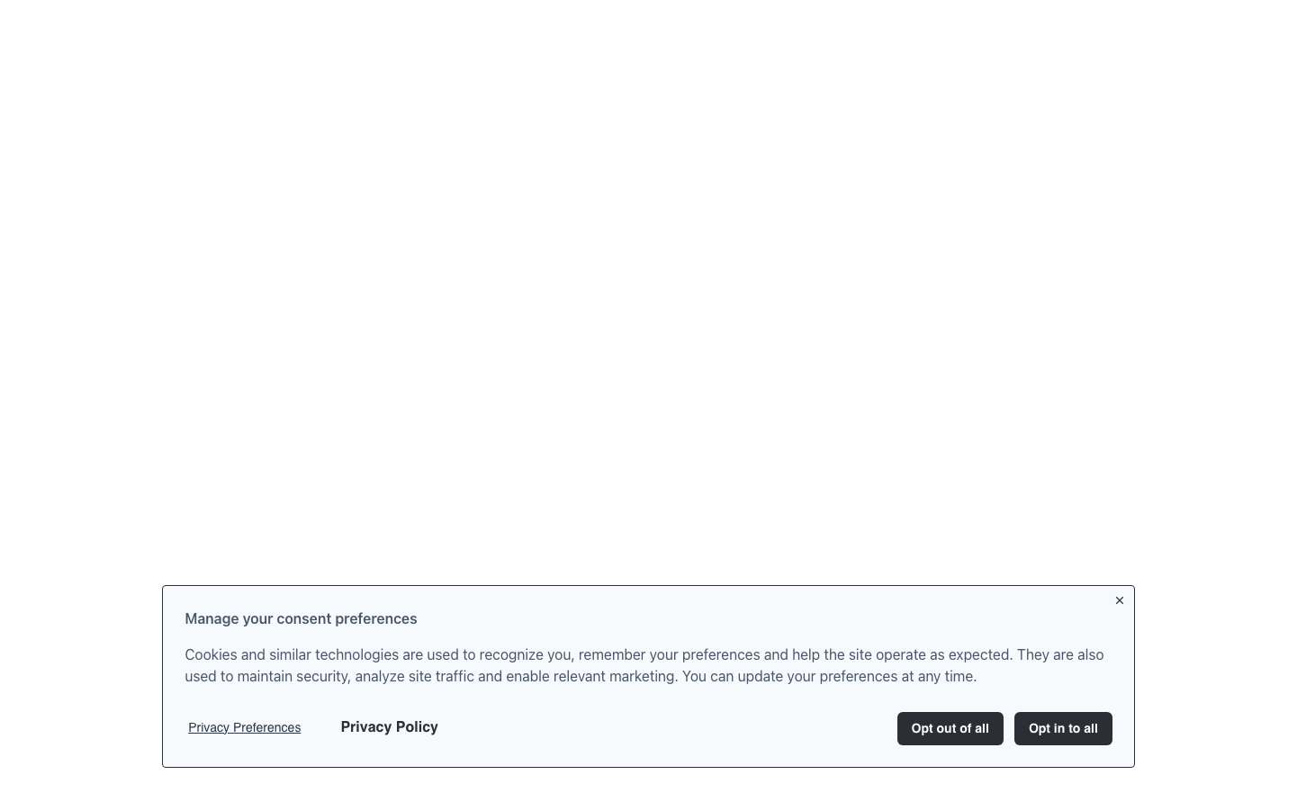
FintechToast embraces institutional compliance through a muted, professional aesthetic that prioritizes trustworthiness over excitement. The typography pairing of Effra headlines with Source Sans Pro body text creates a balance between contemporary authority and approachable functionality, while the restrained gray palette communicates serious data handling.
Design Identity
Signature Color
Compliance Charcoal
#2b2e35
institutional trust and privacy-first professionalism
Visual Identity
The distinctive 12px container border radius combined with generous 24px padding creates a uniquely soft-yet-structured modal system that feels less intrusive than typical consent overlays.
Component Style
Softly rounded components with 6px button radius and 12px container radius create approachable professionalism. No harsh shadows or borders - everything relies on subtle background color shifts and the signature 24px padding for definition.
Spacing Philosophy
Consistent 24px padding creates breathing room that reduces consent fatigue, while modest border radius values (4px badges, 6px buttons, 12px containers) maintain professional restraint without feeling corporate-cold.
Design Principles
- Border radius increases with component importance: 4px badges, 6px buttons, 12px containers
- Typography hierarchy uses only Effra for headings, Source Sans Pro for everything else
- All interactive states rely on background color shifts, never borders or shadows
- 24px becomes the universal spacing unit for component padding
- Color palette stays within gray spectrum except for semantic states (green success, red error)
Target Audience
Privacy compliance officers and legal teams who need consent management that feels authoritative rather than marketing-driven
Mood
Design descriptions are AI-generated based on visual analysis and may not fully reflect the brand's official design guidelines.
Design System
Typography Scale
| Element | Font | Size | Weight | Line Height |
|---|---|---|---|---|
| body | 16px | 400 | 24px | |
| h1 | 64px | 400 | 64px | |
| h2 | 45px | 500 | 48px | |
| h3 | 31px | 500 | 40px | |
| h4 | 22px | 400 | 32px | |
| h5 | 15px | 400 | 15px | |
| p | 16px | 400 | 24px | |
| a | 16px | 600 | 24px | |
| button | 16px | 400 | 24px | |
| input | 16px | 400 | 24px |
Color Palette
#2b2e35#f7fafc#4a5568#2d3748#edf2f7#38a169#ffffff#e53e3e#e2e8f0#f7c2c2#000000#a0aec0


