Help us build this. Leave comments, suggest improvements, and help create better design documentation for agents.
Temenos
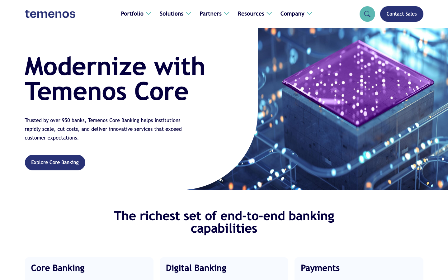
FintechTemenos projects enterprise-grade fintech sophistication through isometric 3D illustrations paired with deep navy typography on clean white space. The brand balances corporate authority with approachable warmth, using a vibrant purple accent as a technological beacon against a backdrop of professional restraint.
Design Identity
Signature Color
Fintech Violet
#9b51e0
innovation leadership in enterprise banking technology
Visual Identity
Distinctive isometric 3D cube illustrations with glowing purple surfaces and interconnected data streams - creates a signature 'digital infrastructure' aesthetic that immediately signals banking technology modernization.
Component Style
Generously rounded components with 28px border radius for primary elements, soft shadows (0.5rem blur), and substantial padding. Buttons feel pillowy and approachable rather than sharp or clinical - prioritizing trust over tech aggression.
Spacing Philosophy
Asymmetric layout with generous left-side whitespace for text content balanced against rich visual content on the right. Creates executive presentation rhythm with breathing room that suggests premium positioning and unhurried consideration.
Design Principles
- Border radius uses only 12px standard and 28px large - never sharp corners
- Typography hierarchy spans 80px hero down to 16px body with consistent 600 weight for headers
- Shadows are always soft (0.5-1rem blur) never hard edges
- Purple accent (#9b51e0) reserved for key technological elements and primary actions
- Isometric 3D illustrations mandatory for hero sections to establish tech credibility
Target Audience
Banking executives and IT decision-makers at mid-to-large financial institutions seeking core system modernization with proven enterprise-grade solutions.
Mood
Design descriptions are AI-generated based on visual analysis and may not fully reflect the brand's official design guidelines.
Design System
Typography Scale
| Element | Font | Size | Weight | Line Height |
|---|---|---|---|---|
| body | 16px | 400 | 24px | |
| h1 | 80px | 600 | 80px | |
| h2 | 40px | 600 | 40px | |
| h3 | 28px | 600 | 28px | |
| p | 16px | 400 | 28px | |
| a | 20px | 400 | 30px | |
| button | 20px | 400 | 20px | |
| input | 20px | 400 | 30px | |
| nav | 16px | 400 | 24px | |
| header | 16px | 400 | 24px |
Color Palette
#dee2e6#000000#abb8c3#ffffff#f78da7#cf2e2e#ff6900#fcb900#7bdcb5#00d084#8ed1fc#0693e3