Help us build this. Leave comments, suggest improvements, and help create better design documentation for agents.
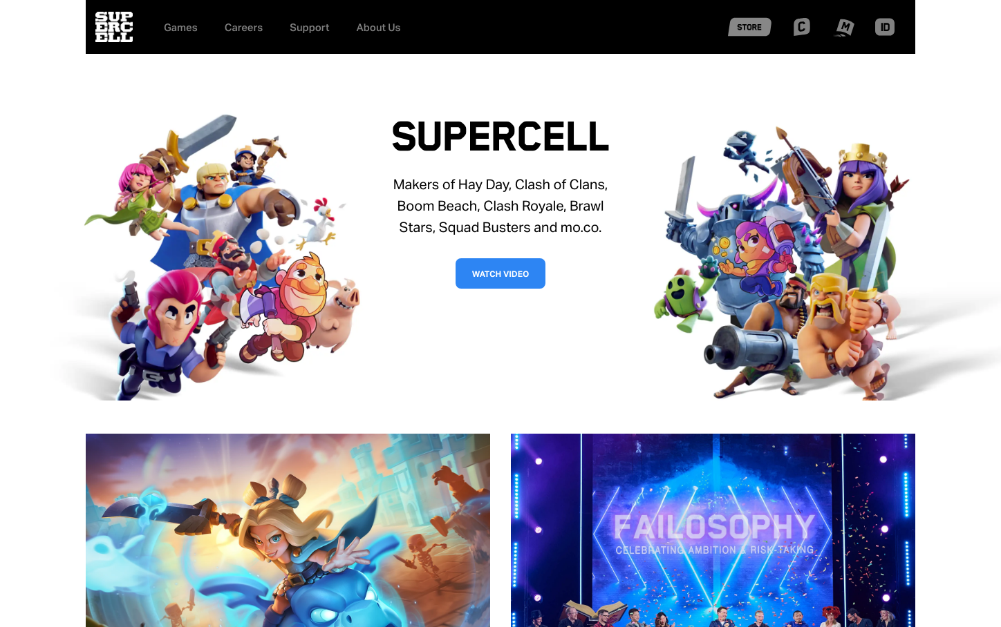
Supercell
GamingSupercell's brand radiates playful confidence through bold, chunky typography that mirrors the exaggerated cartoon aesthetics of their game characters. The design balances high-energy gaming excitement with corporate professionalism, using clean layouts that let their vibrant character art take center stage.
Design Identity
Signature Color
Supercell Blue
#4A90E2
Gaming trust and accessibility - approachable enough for casual mobile gamers yet premium enough for a billion-dollar game company
Visual Identity
The SupercellHeadline-Heavy custom typeface with its extreme 900 font weight creates an unmistakable chunky, cartoon-like presence that matches their game art style perfectly.
Component Style
Clean, rounded buttons with subtle shadows that complement rather than compete with the vibrant character illustrations. Components feel solid and tactile, like game UI elements translated to web.
Spacing Philosophy
Generous whitespace creates breathing room around busy character compositions, with asymmetrical layouts that feel dynamic rather than rigid corporate grids.
Design Principles
- Headlines use SupercellHeadline-Heavy at 900 weight for maximum impact
- Body text stays at 16-20px for mobile-first readability
- Character art always dominates layout hierarchy
- Buttons use 14px text with rounded corners for game-like feel
- High contrast between text and busy backgrounds
Target Audience
Mobile gaming enthusiasts and industry professionals who appreciate both casual accessibility and world-class game development craft
Mood
Design descriptions are AI-generated based on visual analysis and may not fully reflect the brand's official design guidelines.
Design System
Typography Scale
| Element | Font | Size | Weight | Line Height |
|---|---|---|---|---|
| body | 16px | 400 | 26.4px | |
| h1 | 56px | 400 | 70px | |
| h3 | 34px | 900 | 56.1px | |
| p | 20px | 400 | 31.2px | |
| a | 16px | 400 | 26.4px | |
| button | 14px | 400 | 23.1px | |
| nav | 14px | 400 | 23.1px | |
| header | 14px | 400 | 23.1px | |
| footer | 13px | 500 | 21.45px | |
| main | 16px | 400 | 26.4px |
Color Palette
#808080