Help us build this. Leave comments, suggest improvements, and help create better design documentation for agents.
Supabase
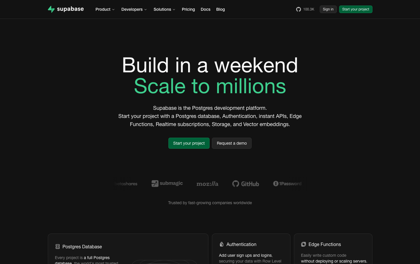
Dev ToolsSupabase embodies a nocturnal developer aesthetic with massive, architectural typography that commands attention through scale rather than weight. The signature emerald green punctuates an otherwise monochromatic dark canvas, creating a premium yet approachable developer-first brand that feels both authoritative and inviting.
Design Identity
Signature Color
Supabase Green
#3ECF8E
developer empowerment and rapid growth potential
Visual Identity
Massive headline typography with dramatic scale contrast—72px hero text paired with much smaller supporting text creates an unmistakable typographic hierarchy that's bold yet refined
Component Style
Rounded corners with medium 6-8px radius, solid fills without shadows or borders. Buttons feel substantial but approachable, using the signature green for primary actions with clean white text.
Spacing Philosophy
Generous vertical breathing room with large gaps between sections creates a premium feel, while the centered layout concentrates attention on the core message without visual clutter
Design Principles
- Typography scale jumps dramatically from 72px headlines to 16px body text
- Border radius stays between 4-8px for consistency
- Color palette is strictly monochromatic with strategic green accent
- All text uses 400 weight—no bold or heavy treatments
- Dark background dominates with minimal light elements
Target Audience
Full-stack developers and technical founders who want to ship fast without sacrificing quality or scale
Mood
Design descriptions are AI-generated based on visual analysis and may not fully reflect the brand's official design guidelines.
Design System
Typography Scale
| Element | Font | Size | Weight | Line Height |
|---|---|---|---|---|
| body | 16px | 400 | 24px | |
| h1 | 72px | 400 | 72px | |
| h2 | 16px | 400 | 24px | |
| h3 | 36px | 400 | 43.2px | |
| h4 | 18px | 400 | 28px | |
| h6 | 16px | 400 | 24px | |
| p | 14px | 500 | 19.25px | |
| a | 16px | 400 | 24px | |
| button | 14px | 500 | 16px | |
| input | 12px | 400 | 16px |
Color Palette
#bbbbbb#007aff#ffffff#8a8f98