Help us build this. Leave comments, suggest improvements, and help create better design documentation for agents.
Substack
MediaSubstack embodies editorial sophistication through warm orange accents (#ff6719) paired with publishing-quality serif typography (Spectral). The design feels like a premium literary magazine with generous whitespace and confident typography choices that prioritize readability and creator expression over flashy interfaces.
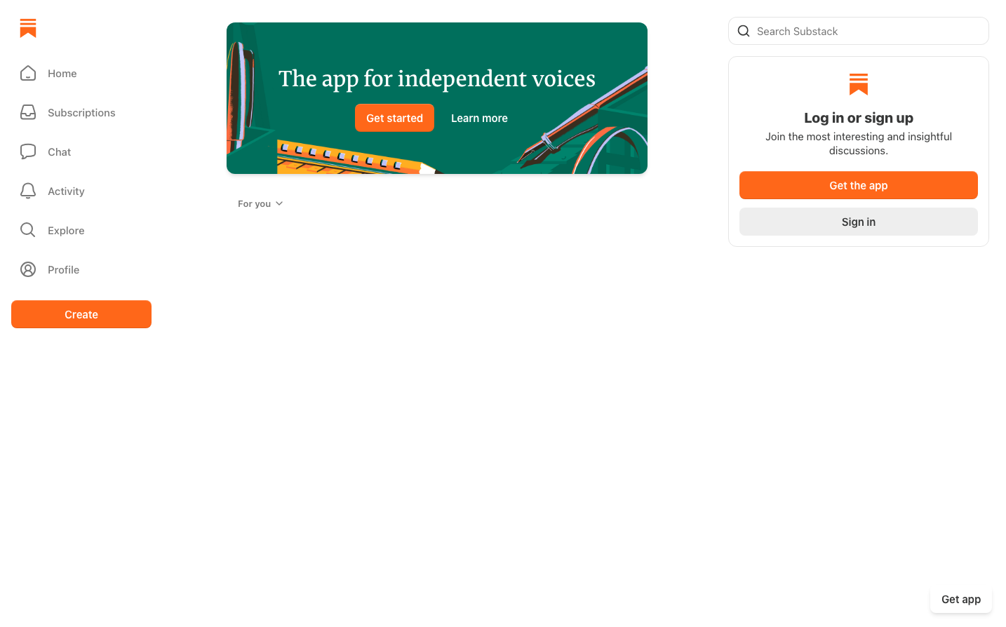
Design Identity
Signature Color
Substack Orange
#ff6719
Creative energy and independent publishing spirit - signals warmth, authenticity, and the passion of independent creators
Visual Identity
Generous whitespace combined with mixed typography hierarchy - serif for content (Spectral) and sans-serif for UI (SF Pro Display) - creating a sophisticated publishing platform aesthetic that feels more literary magazine than typical SaaS product.
Component Style
Soft, rounded components with 8-12px border radius. Buttons have substantial padding and feel approachable rather than sharp. The orange primary buttons are warm and inviting, while secondary actions use clean outlines. Everything feels crafted for writers rather than developers.
Spacing Philosophy
Expansive breathing room dominates the layout with large gaps between sections, giving content and interface elements room to breathe. This mirrors traditional publishing layouts where whitespace enhances readability and creates a premium feel.
Design Principles
- Typography mixing: Serif for content (Spectral), sans-serif for UI (SF Pro Display)
- Border radius stays between 8-12px for friendly approachability
- Orange (#ff6719) used sparingly as primary accent for maximum impact
- 19px body text ensures comfortable reading experience
- Generous padding (16px+) on interactive elements for writer-friendly UX
Target Audience
Independent writers, newsletter creators, and content entrepreneurs who value editorial quality and reader experience over complex feature sets.
Mood
Design descriptions are AI-generated based on visual analysis and may not fully reflect the brand's official design guidelines.
Design System
Typography Scale
| Element | Font | Size | Weight | Line Height |
|---|---|---|---|---|
| body | 19px | 400 | normal | |
| h3 | 32px | 500 | 39.68px | |
| h4 | 20px | 800 | 24px | |
| a | 19px | 400 | normal | |
| button | 19px | 400 | normal | |
| input | 15px | 400 | 20px |
Color Palette
#ffffff#f0f0f0#ff6719#e6e6e6#0076ff#000000#1bc47d#ff7772#eeeeee#eb5757#777777#7b61ff