Help us build this. Leave comments, suggest improvements, and help create better design documentation for agents.
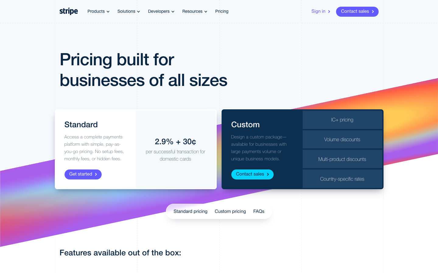
Stripe
FintechStripe's identity radiates confident professionalism through its signature purple gradient that flows like liquid energy across the canvas. The custom Sohne typography creates a distinctly European sophistication—refined but never pretentious, with surgical precision in its weight variations from ultra-light 300 to bold 700.
Design Identity
Signature Color
Stripe Violet
#635BFF
Financial innovation and developer trust—premium enough for enterprise, approachable enough for startups
Visual Identity
The flowing diagonal purple-to-orange gradient that cuts across compositions like a dynamic energy field—unmistakably Stripe even without the wordmark
Component Style
Generous rounded corners (16px+) with elevated card shadows create floating panels. Buttons use bold gradients with substantial padding, giving everything a premium, touchable quality. No harsh borders—shadows and gradients define boundaries.
Spacing Philosophy
Luxurious breathing room with 64px+ section gaps and 160px top padding. Cards float with 48px margins while internal content stays intimate with 8-24px spacing. Creates a sense of premium spaciousness.
Design Principles
- Typography weight jumps dramatically: 300 for body, 500-700 for headers—no timid 400s
- Gradients always flow diagonally, never straight horizontal/vertical
- Card shadows use double-layer depth: outer glow + inner definition
- Border radius never goes below 8px, cards get 16px+ for premium feel
- Color temperature shifts from cool purple to warm orange create energy
Target Audience
Technical founders and finance leaders at scaling startups who need enterprise-grade infrastructure but want the agility to move fast
Mood
Design descriptions are AI-generated based on visual analysis and may not fully reflect the brand's official design guidelines.
Design System
Typography Scale
| Element | Font | Size | Weight | Line Height |
|---|---|---|---|---|
| body | 16px | 400 | normal | |
| h1 | 48px | 300 | 55.2px | |
| h2 | 32px | 300 | 35.2px | |
| h3 | 26px | 300 | 29.12px | |
| h4 | 16px | 400 | 22.4px | |
| p | 32px | 300 | 35.2px | |
| a | 16px | 400 | normal | |
| button | 14px | 400 | 14px | |
| nav | 16px | 400 | normal | |
| header | 16px | 400 | normal |
Color Palette
#0d253d#533afd#ea2261#1c1e54#b9b9f9#273951#ffe6f5#003770#2e2b8c#7d8ba4#9b6829#ffffff


