Help us build this. Leave comments, suggest improvements, and help create better design documentation for agents.
Strapi
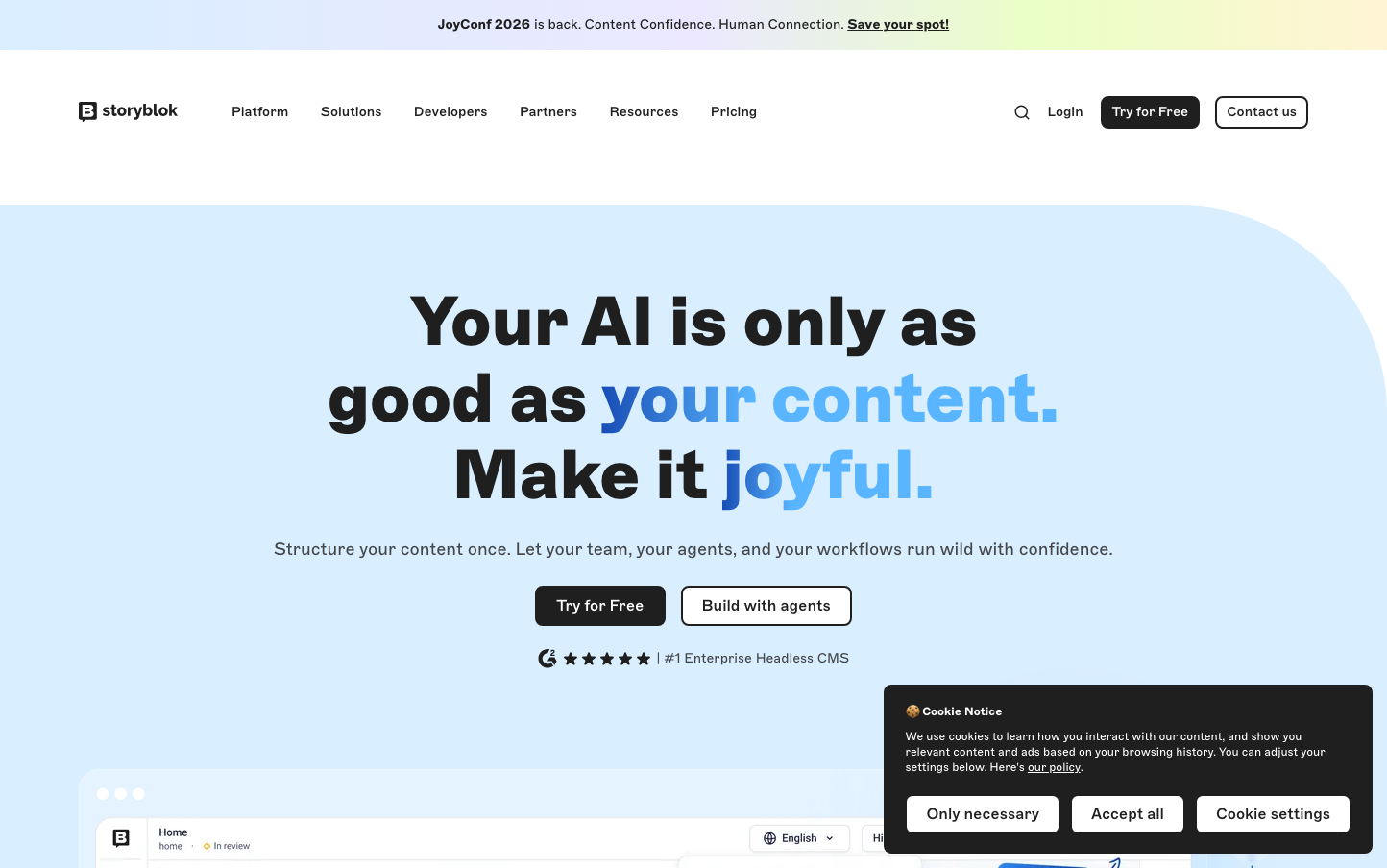
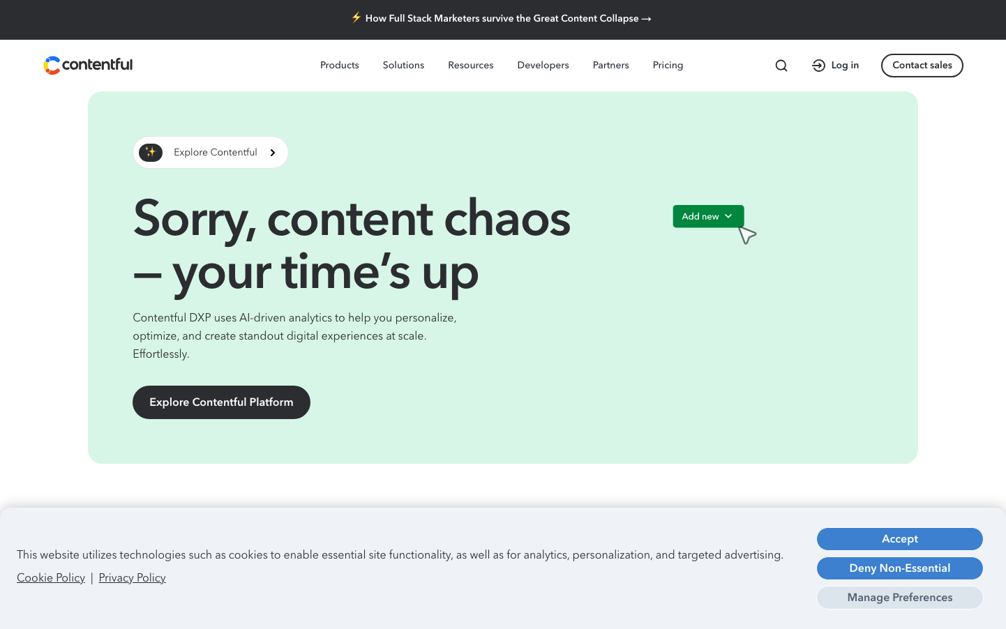
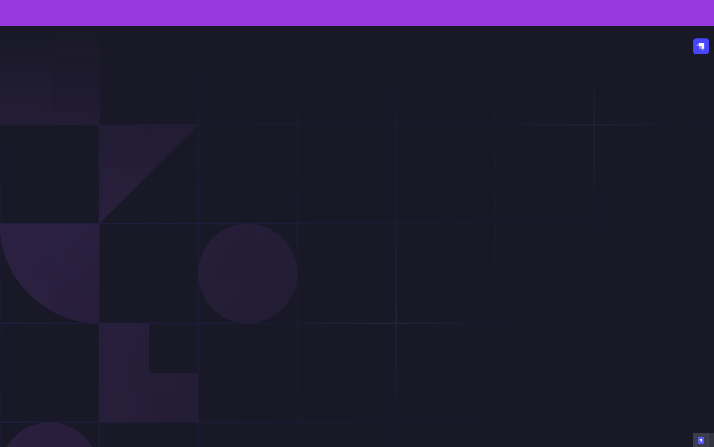
CMSStrapi embraces a cinematic darkness with rich purple-to-black gradients that feel like a premium developer tool for the nocturnal coder. The Poppins typography creates approachable sophistication - technical enough for developers but friendly enough for content creators, perfectly matching their headless CMS positioning.
Design Identity
Signature Color
Strapi Violet
#8B5CF6
Creative developer empowerment - bridging the technical and artistic sides of content management
Visual Identity
Dramatic dark gradients with subtle geometric overlays and question mark iconography - creates an atmosphere of mystery and discovery that makes complex backend tools feel approachable.
Component Style
Smooth rounded corners with subtle gradients and minimal borders - components feel soft and inviting rather than sharp and intimidating, with gentle hover states that maintain the mysterious dark aesthetic.
Spacing Philosophy
Generous breathing room with large sections that let the dark gradients dominate - creates a sense of depth and premium positioning while keeping interactive elements accessible and uncluttered.
Design Principles
- Typography exclusively uses Poppins at 700 weight for headlines, 500 for buttons, 400 for body text
- All interactive elements maintain 8-12px border radius for approachable softness
- Purple gradients always transition from saturated to dark, never light
- Question mark iconography reinforces the 'discover possibilities' narrative
- Dark backgrounds dominate 80%+ of screen real estate
Target Audience
Full-stack developers and technical content managers who want powerful backend tools that don't feel intimidating to their non-technical teammates
Mood
Design descriptions are AI-generated based on visual analysis and may not fully reflect the brand's official design guidelines.
Design System
Typography Scale
| Element | Font | Size | Weight | Line Height |
|---|---|---|---|---|
| body | 16px | 400 | 16px | |
| h1 | 53px | 700 | 71px | |
| h2 | 21px | 600 | 30px | |
| p | 15px | 400 | 22.5px | |
| a | 15px | 400 | 22.5px | |
| button | 15px | 500 | 15px | |
| nav | 16px | 400 | 16px | |
| header | 16px | 400 | 16px | |
| footer | 16px | 400 | 16px | |
| main | 16px | 400 | 16px |
Color Palette
No colors extracted