Help us build this. Leave comments, suggest improvements, and help create better design documentation for agents.
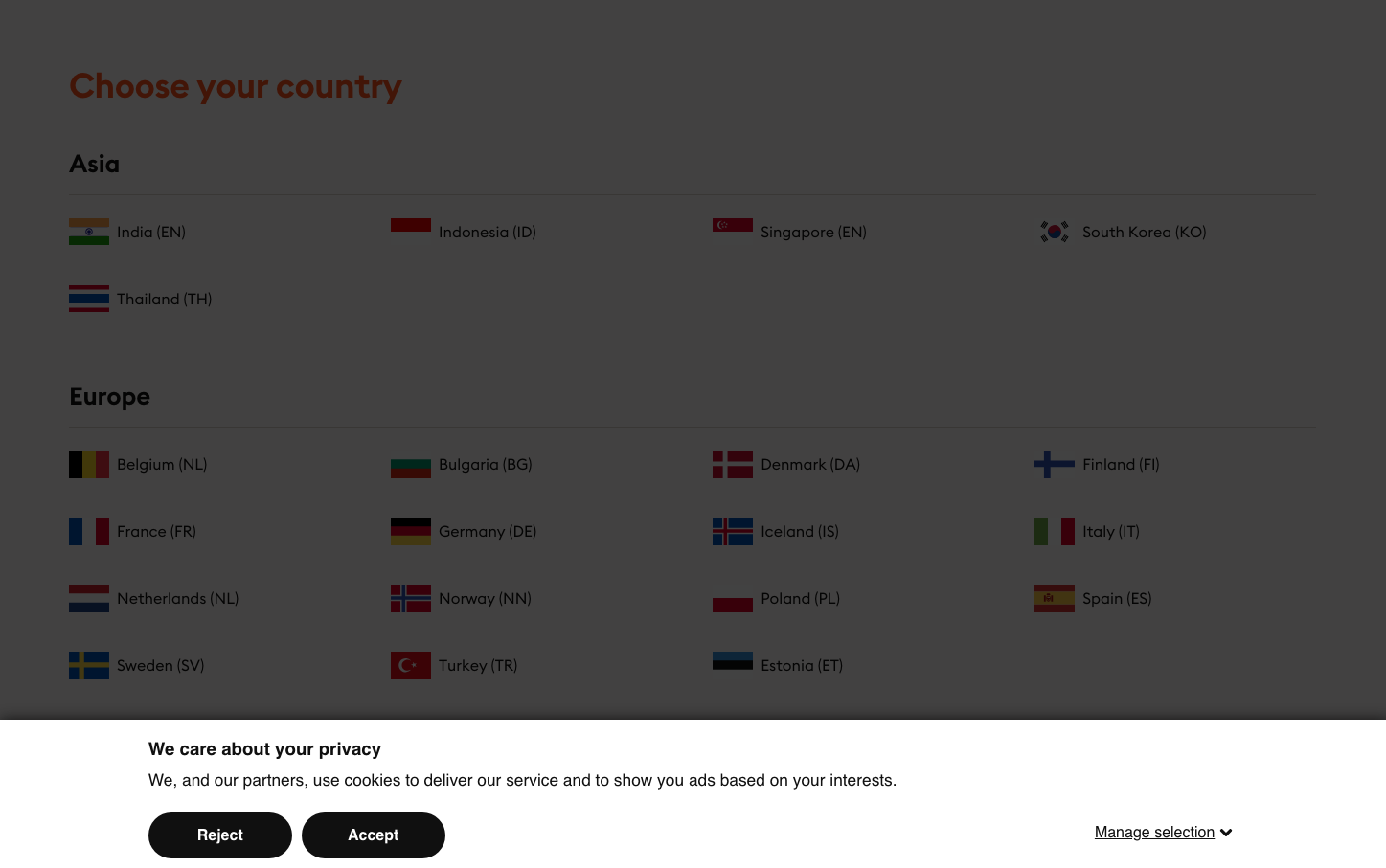
Storytel
MediaStorytel embraces a dark, immersive aesthetic that mirrors the intimate experience of audiobook listening. The charcoal-heavy interface with warm orange accents (#ff501c) creates a cozy, literary atmosphere that feels like reading by candlelight.
Design Identity
Signature Color
Storytel Orange
#ff501c
Literary warmth and narrative passion - the glow of a story coming to life
Visual Identity
The dark overlay foundation (#000000) combined with systematic country/region selection grids creates a Netflix-like premium content discovery experience, but specifically tailored for audiobook consumption patterns.
Component Style
Minimal rectangular buttons with clean typography, no visible shadows or heavy borders. Everything feels flat and content-focused, like digital book pages. The orange accent color provides the only vibrant touch against the muted palette.
Spacing Philosophy
Generous vertical spacing between country sections creates clear content hierarchy, while compact flag-and-text pairings maintain scanning efficiency. The layout prioritizes quick regional selection without overwhelming choice paralysis.
Design Principles
- Dark overlays dominate (#000000) for immersive reading-like experience
- Orange accent (#ff501c) used sparingly for primary actions only
- Typography weight never exceeds 700 for comfortable extended reading
- Country selection uses consistent flag-text-code pattern for global usability
- Privacy messaging uses subtle contrast to avoid disrupting content flow
Target Audience
Global audiobook enthusiasts who consume content across devices and appreciate Netflix-style content discovery with literary sophistication
Mood
Design descriptions are AI-generated based on visual analysis and may not fully reflect the brand's official design guidelines.
Design System
Typography Scale
| Element | Font | Size | Weight | Line Height |
|---|---|---|---|---|
| body | 16px | 400 | 22.4px | |
| h1 | 36px | 600 | 35.1px | |
| h2 | 18.6667px | 700 | 22.4px | |
| h3 | 12px | 400 | 14.772px | |
| p | 17.3333px | 400 | 21.3373px | |
| a | 12px | 400 | 22.4px | |
| button | 16px | 600 | normal | |
| input | 12px | 400 | normal |
Color Palette
#fffbfa#ffffff#000000#101010#4d4d4d#ff501c#5c5c5c#dcd5cd#fff2f1#c2c2c2#dbdbdb#efefef