Help us build this. Leave comments, suggest improvements, and help create better design documentation for agents.
Stori
FintechStori radiates Latin American fintech optimism through its signature electric emerald green paired with sophisticated dark teals. The bold f37hybrid headlines create confident statements while Inter provides trustworthy readability, establishing a brand that feels both approachable and financially credible.
Design Identity
Signature Color
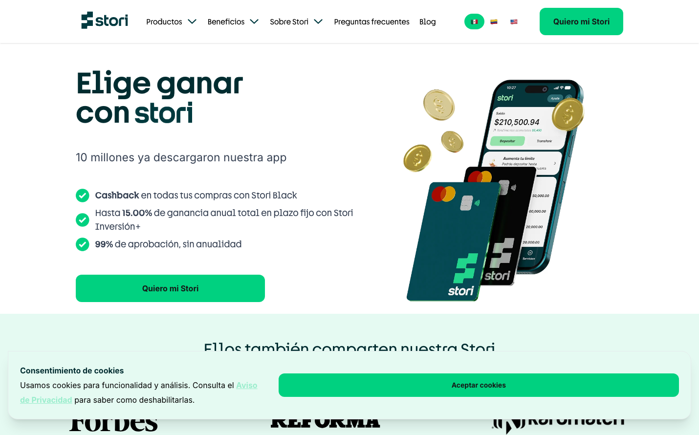
Stori Emerald
#00d180
Financial growth and prosperity - vibrant enough to inspire confidence yet professional enough for banking
Visual Identity
The distinctive emerald-to-teal gradient system combined with bold geometric typography creates an unmistakably Latin fintech aesthetic that balances aspiration with accessibility.
Component Style
Moderately rounded corners (8-12px) with solid fills and subtle shadows. Components feel substantial but approachable - not the razor-sharp precision of enterprise tools, but confident enough for financial services. Buttons have generous padding and clear hierarchy.
Spacing Philosophy
Generous breathing room between major sections creates an aspirational, premium feel while maintaining approachable density. The layout prioritizes visual impact over information density, with large hero elements and ample whitespace.
Design Principles
- Border radius stays between 8-24px for friendly but professional feel
- Headlines use f37hybrid at 60px for maximum impact
- Green gradient system spans from #003a40 to #00d180 for depth
- Body text uses Inter for financial trustworthiness
- Shadows are subtle (4-9px) to maintain approachability
Target Audience
Emerging middle-class consumers in Latin America who are building credit history and seeking their first premium financial products
Mood
Design descriptions are AI-generated based on visual analysis and may not fully reflect the brand's official design guidelines.
Design System
Typography Scale
| Element | Font | Size | Weight | Line Height |
|---|---|---|---|---|
| body | 16px | 400 | 24px | |
| h1 | 60px | 600 | 60px | |
| h2 | 23px | 400 | 32.2px | |
| h3 | 24px | 400 | 32px | |
| p | 15px | 400 | 21px | |
| a | 16px | 400 | 24px | |
| button | 15px | 400 | 21px | |
| nav | 16px | 400 | 24px | |
| header | 16px | 400 | 24px | |
| footer | 16px | 400 | 24px |
Color Palette
#003a40#336166#058e65#00d180#33da99#66e3b3#99edcc#b3f2d9#e5faf2#f0fcf7#8a6c00#f4b843