Help us build this. Leave comments, suggest improvements, and help create better design documentation for agents.
Stone
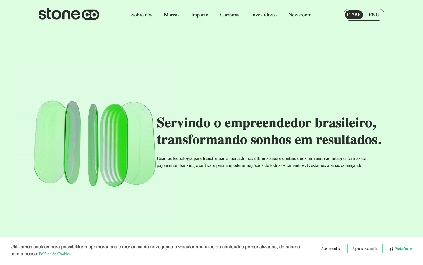
FintechStone's brand aesthetic centers on ethereal translucency and dimensional depth, using overlapping glass-like geometric forms in vibrant greens that create a sense of technological innovation floating in serene space. The Roobert typography maintains approachable professionalism while the abundant whitespace and layered visual elements communicate forward-thinking fintech solutions.
Design Identity
Signature Color
Stone Vivid Green
#00d084
financial growth and technological innovation with Brazilian energy
Visual Identity
Translucent, overlapping geometric shapes in varying shades of green that create depth through transparency effects - like seeing through multiple layers of tinted glass
Component Style
Clean, minimal components with subtle shadows and generous padding. Typography-focused with the distinctive Roobert font creating approachable yet professional touchpoints. Elements feel lightweight and spacious rather than dense or heavy.
Spacing Philosophy
Extremely generous whitespace creates a premium, uncluttered experience. Large gaps between sections allow the translucent geometric artwork to breathe, while text content uses comfortable line-height ratios for easy reading.
Design Principles
- Typography uses only Roobert font family across all elements
- Green color palette dominates with vivid-green-cyan (#00d084) as primary
- Shadows range from natural (6px 6px 9px) to sharp geometric effects
- Line heights are generous: 1.2x to 1.75x the font size
- Button font weight is unusually light at 100 weight
Target Audience
Brazilian entrepreneurs and business owners seeking sophisticated fintech solutions who value innovation over traditional banking approaches
Mood
Design descriptions are AI-generated based on visual analysis and may not fully reflect the brand's official design guidelines.
Design System
Typography Scale
| Element | Font | Size | Weight | Line Height |
|---|---|---|---|---|
| body | 16px | 400 | normal | |
| h1 | 48px | 600 | 57.6px | |
| h2 | 24px | 700 | 42px | |
| h5 | 15px | 400 | 19.5px | |
| h6 | 12px | 400 | 19.2px | |
| p | 16px | 400 | 20.8px | |
| a | 14px | 400 | 21px | |
| button | 12px | 100 | normal | |
| input | 12px | 400 | 12px | |
| nav | 16px | 400 | normal |
Color Palette
#000000#abb8c3#ffffff#f78da7#cf2e2e#ff6900#fcb900#7bdcb5#00d084#8ed1fc#0693e3#9b51e0