Help us build this. Leave comments, suggest improvements, and help create better design documentation for agents.
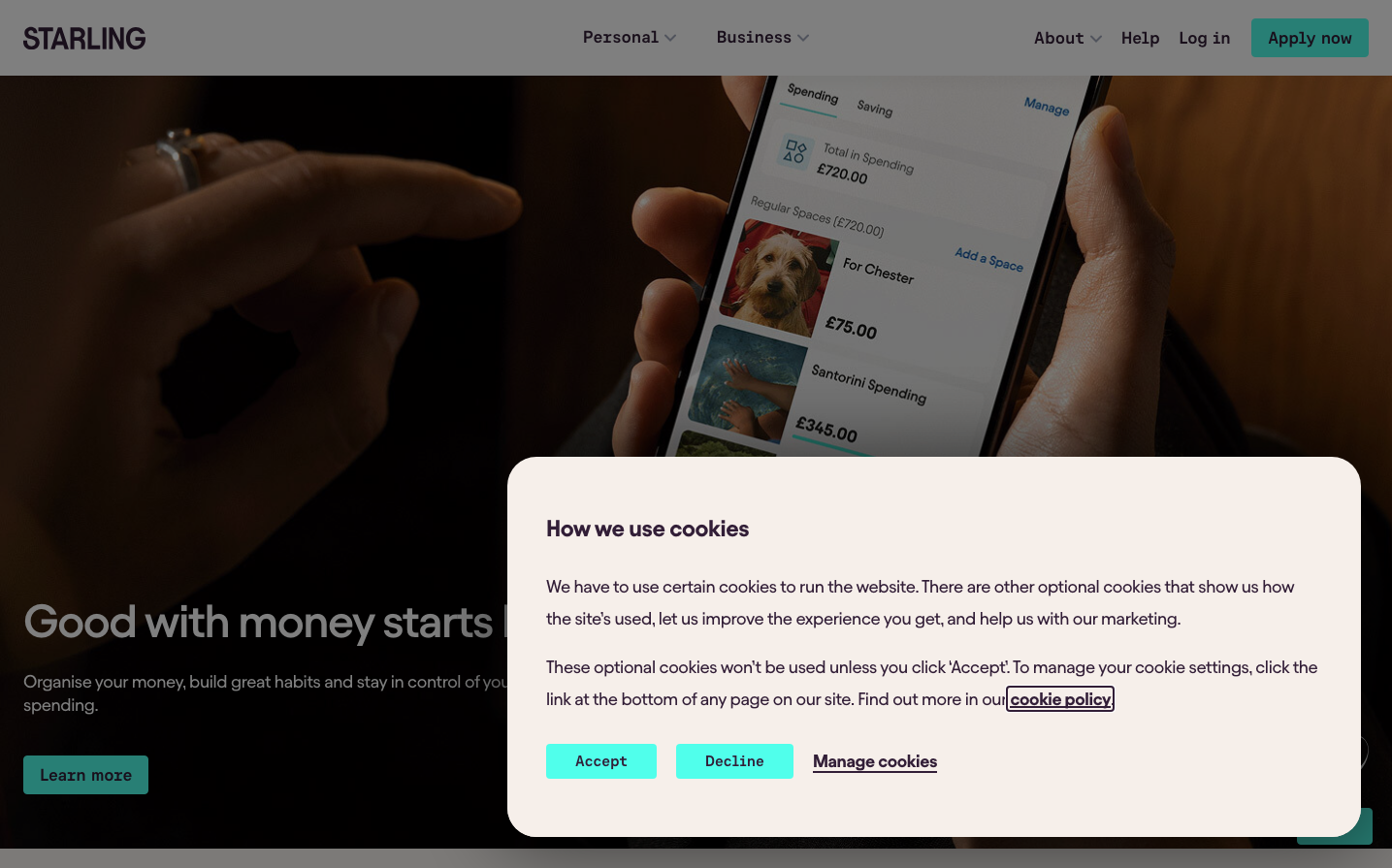
Starling Bank
NeobankStarling Bank's identity balances warm banking trust with digital-native confidence through electric turquoise that feels both fresh and reliable. The Avantt typeface creates approachable sophistication while the semi-mono button typography signals technical precision - perfect for a fintech that's serious about craft.
Design Identity
Signature Color
Starling Turquoise
#19d3c5
digital-native banking innovation with approachable trust
Visual Identity
The electric turquoise paired with warm cream backgrounds and semi-mono button typography creates an instantly recognizable fintech aesthetic that feels both human and technically sophisticated.
Component Style
Rounded corners with generous padding and the signature turquoise treatment. Buttons use semi-mono typography for technical credibility while maintaining approachable rounded edges. Clean hover states with subtle color shifts rather than shadows.
Spacing Philosophy
Generous breathing room with clean sectional breaks. The mobile-first layout uses comfortable touch targets and logical content hierarchy that never feels cramped or overwhelming.
Design Principles
- Primary actions always use #19d3c5 turquoise
- Body text uses custom weight 450 for softer readability
- Buttons exclusively use semi-mono typography for technical trust
- Warm cream #f6efea backgrounds soften the digital experience
- Hover states shift color temperature rather than add effects
Target Audience
Tech-savvy millennials and Gen-Z who want banking that feels as sophisticated as their favorite apps but more trustworthy than traditional fintech
Mood
Design descriptions are AI-generated based on visual analysis and may not fully reflect the brand's official design guidelines.
Design System
Typography Scale
| Element | Font | Size | Weight | Line Height |
|---|---|---|---|---|
| body | 18px | 450 | 24px | |
| h1 | 48px | 550 | 54px | |
| h2 | 36px | 550 | 40px | |
| h3 | 21.06px | 600 | 24px | |
| h4 | 24px | 600 | 26px | |
| p | 18px | 450 | 24px | |
| a | 18px | 450 | 24px | |
| button | 18px | 550 | 24px | |
| nav | 18px | 450 | 24px | |
| footer | 18px | 450 | 24px |
Color Palette
#000000#f6efea#50ffeb#19d3c5#b1eddf#277463#29e6d1#efefef#e7e7e7#d0d0d0#706273