Help us build this. Leave comments, suggest improvements, and help create better design documentation for agents.
Spike
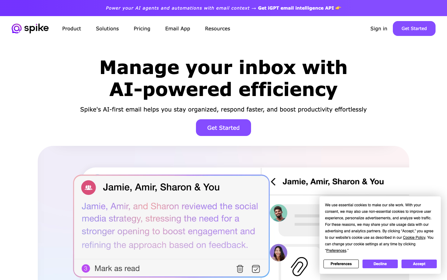
CommunicationSpike's brand radiates AI-powered sophistication through its signature vibrant purple that commands attention while maintaining trust. The generous use of whitespace and rounded, pill-shaped buttons create an approachable yet premium feel that positions AI email management as both powerful and effortless.
Design Identity
Signature Color
Spike Violet
#8B5CF6
AI innovation meets trustworthy productivity - a color that bridges cutting-edge technology with reliable business tools
Visual Identity
The ultra-rounded, pill-shaped buttons with substantial padding create a distinctive soft-tech aesthetic that's immediately recognizable, especially when combined with the strategic use of vibrant purple against clean white backgrounds.
Component Style
Heavily rounded components (24px+ border radius) with generous padding create a soft, approachable feel. Buttons are pill-shaped with smooth gradients, and the email preview card shows subtle shadows with gentle curves throughout - everything feels touchable and friendly.
Spacing Philosophy
Expansive breathing room dominates the layout with large 80px+ gaps between major sections. The hero area uses dramatic whitespace to let the headline command attention, while internal component spacing remains generous at 16-24px intervals.
Design Principles
- Border radius consistently exceeds 20px for primary interactive elements
- Typography hierarchy spans from 59px headlines to 16px body text with clear weight differentiation
- Purple accent color used sparingly but prominently for key CTAs and branding
- Whitespace ratios maintain 3:1 or higher between sections and content blocks
- All shadows are subtle and soft, never harsh or geometric
Target Audience
Busy professionals and knowledge workers who want AI to handle email complexity without sacrificing control - people who value both efficiency and thoughtful design
Mood
Design descriptions are AI-generated based on visual analysis and may not fully reflect the brand's official design guidelines.
Design System
Typography Scale
| Element | Font | Size | Weight | Line Height |
|---|---|---|---|---|
| body | 18px | 400 | 20.7px | |
| h1 | 59.32px | 700 | 71.184px | |
| h2 | 44px | 700 | 54.78px | |
| h3 | 23.22px | 700 | 30.186px | |
| p | 16px | 300 | 22.4px | |
| a | 14px | 400 | 23.3296px | |
| button | 12px | 700 | 12px | |
| nav | 18px | 400 | 18px | |
| header | 18px | 400 | 20.7px | |
| footer | 12px | 400 | 13.8px |
Color Palette
No colors extracted