Help us build this. Leave comments, suggest improvements, and help create better design documentation for agents.
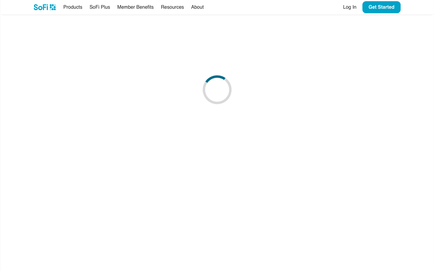
SoFi
NeobankSoFi presents a confident, accessible fintech aesthetic that balances professionalism with approachability. The signature cyan blue evokes digital trust and financial clarity, while the dual typography system (TT Norms + Larsseit) creates both warmth and authority. The design feels optimistic and democratizing - financial services for everyone, not just the wealthy.
Design Identity
Signature Color
SoFi Cyan Blue
#0693e3
Digital financial trust and accessible innovation - a friendlier alternative to traditional banking blues
Visual Identity
The distinctive cyan blue paired with generous white space and the confident dual-font hierarchy - headlines in bold Larsseit, UI elements in approachable TT Norms.
Component Style
Softly rounded buttons with 4-6px radius, bold 700 weight text, and confident cyan backgrounds. Components feel substantial but approachable - not razor-sharp corporate, but not overly casual either. Clean edges with minimal shadows.
Spacing Philosophy
Generous breathing room that suggests financial abundance and clarity. Clean header with ample padding creates premium feel while maintaining accessibility. White space is used strategically to reduce cognitive load around financial decisions.
Design Principles
- Typography weight never goes below 500 - everything feels confident
- Cyan blue (#0693e3) dominates all primary actions
- Border radius stays gentle at 4-6px - approachable but professional
- Font sizes follow clear hierarchy: 50px headlines, 16px UI, 14px inputs
- TT Norms for UI, Larsseit for content - dual personality system
Target Audience
Millennial and Gen-Z professionals seeking modern financial services - tech-savvy individuals who want banking that feels as intuitive as their favorite apps
Mood
Design descriptions are AI-generated based on visual analysis and may not fully reflect the brand's official design guidelines.
Design System
Typography Scale
| Element | Font | Size | Weight | Line Height |
|---|---|---|---|---|
| body | 16px | 400 | 24px | |
| h2 | 50px | 800 | 60px | |
| h4 | 19.2px | 700 | 23.04px | |
| p | 16px | 700 | 19.2px | |
| a | 16px | 500 | 24px | |
| button | 16px | 700 | 20px | |
| input | 14px | 400 | 21px | |
| nav | 16px | 500 | 24px | |
| header | 16px | 400 | 24px | |
| footer | 12.8px | 400 | 19.2px |
Color Palette
#000000#abb8c3#ffffff#f78da7#cf2e2e#ff6900#fcb900#7bdcb5#00d084#8ed1fc#0693e3#9b51e0