Help us build this. Leave comments, suggest improvements, and help create better design documentation for agents.
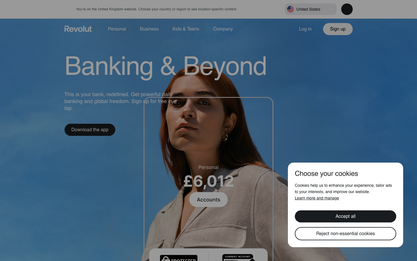
Revolut
NeobankRevolut presents a bold, gradient-driven aesthetic that transforms traditional fintech sterility into an aspirational lifestyle brand. The deep blue-to-purple gradient background creates an immersive, almost cinematic atmosphere that suggests forward momentum and digital sophistication, while the ultra-large Aeonik Pro typography conveys confident authority.
Design Identity
Signature Color
Revolut Blue
#494fdf
Progressive fintech confidence - bridging traditional banking trust with startup innovation energy
Visual Identity
Massive gradient backgrounds paired with oversized typography that breaks conventional fintech layouts - the brand feels more like a premium lifestyle app than a traditional bank
Component Style
Fully rounded pill-style buttons with high contrast and generous padding, creating soft, approachable touchpoints against the dramatic gradient backgrounds. Components favor curves over angles, suggesting accessibility and user-friendliness.
Spacing Philosophy
Asymmetric layout with generous negative space that allows the gradient background to breathe, while UI elements cluster in focused zones with tight internal spacing for mobile-first usability
Design Principles
- Headlines use Aeonik Pro at massive scales (89px+) for maximum impact
- Buttons always use pill radius (9999px) for soft, approachable feel
- Gradients dominate backgrounds to create immersive brand moments
- Typography contrast relies on size hierarchy rather than weight variations
- Color palette stays within blue-purple spectrum for brand cohesion
Target Audience
Digitally-native millennials and Gen Z who view banking as part of their lifestyle identity, not just utility
Mood
Design descriptions are AI-generated based on visual analysis and may not fully reflect the brand's official design guidelines.
Design System
Typography Scale
| Element | Font | Size | Weight | Line Height |
|---|---|---|---|---|
| body | 16px | 400 | normal | |
| h1 | 89.2488px | 500 | 89.2488px | |
| h2 | 52.6244px | 500 | 52.6244px | |
| h3 | 18px | 400 | 24px | |
| p | 12px | 400 | 18px | |
| a | 16px | 400 | normal | |
| button | 16px | 400 | normal | |
| header | 16px | 400 | normal | |
| footer | 16px | 400 | normal | |
| main | 16px | 400 | normal |
Color Palette
#f1f2f4#c9c9cd#efefef#ffffff#f7f7f7#edeefd#376cd5#006400#b09000#191c1f#ebebf0#4f55f1