Help us build this. Leave comments, suggest improvements, and help create better design documentation for agents.
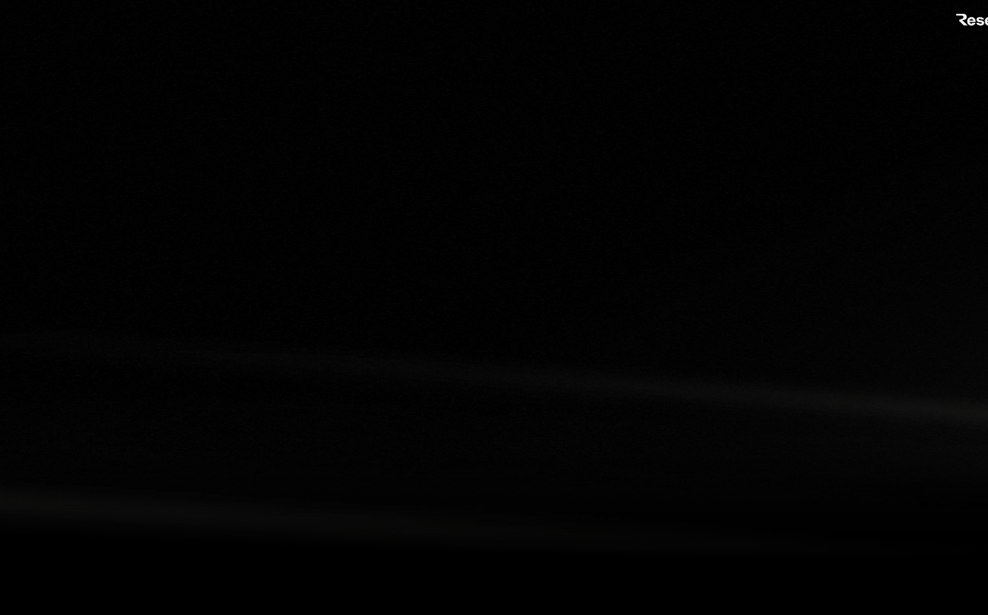
Resend
Dev ToolsResend embraces a void-black foundation that feels both infinite and intimate, creating a developer-first aesthetic that's unapologetically dark. The typography hierarchy mixing serif Domaine headlines with clean Inter body text suggests sophisticated technical communication, while the stark contrast and minimal visual noise communicates precision and focus.
Design Identity
Signature Color
Void Black
#000000
Developer-focused minimalism and uncompromising clarity - the absence of distraction
Visual Identity
The deep black void background with stark white text creates an unmistakable terminal-like aesthetic that feels native to developers while remaining sophisticated enough for business audiences.
Component Style
Invisible components that prioritize content over chrome - likely using minimal borders, subtle hover states, and clean typography hierarchy with no unnecessary visual flourishes or heavy shadows.
Spacing Philosophy
Generous negative space on the black canvas creates breathing room and focus, with likely generous vertical spacing between sections to let content float in the void.
Design Principles
- Background must always be pure black (#000000) for maximum contrast
- Typography uses only three families: Domaine for headlines, ABC Favorit for subheads, Inter for body
- Headline sizes jump dramatically: 96px to 56px to 20px creating clear hierarchy
- Components rely on typography and spacing rather than visual decoration
- Transitions use 0.15s duration with ease-out timing for subtle interactions
Target Audience
Senior developers and technical decision-makers who value craft, precision, and tools that get out of their way
Mood
Design descriptions are AI-generated based on visual analysis and may not fully reflect the brand's official design guidelines.
Design System
Typography Scale
| Element | Font | Size | Weight | Line Height |
|---|---|---|---|---|
| body | 16px | 400 | 24px | |
| h1 | 96px | 400 | 96px | |
| h2 | 56px | 400 | 67.2px | |
| h4 | 20px | 400 | 20px | |
| p | 18px | 400 | 27px | |
| a | 16px | 400 | 24px | |
| button | 16px | 400 | 24px | |
| header | 16px | 400 | 24px | |
| footer | 16px | 400 | 24px |
Color Palette
#ff5900#ff801f#11ff99#22ff99#ffc53d#b0c7d9#0081fd#000033#191b1e#0075ff#3b9eff#ffa057