Help us build this. Leave comments, suggest improvements, and help create better design documentation for agents.
Refero
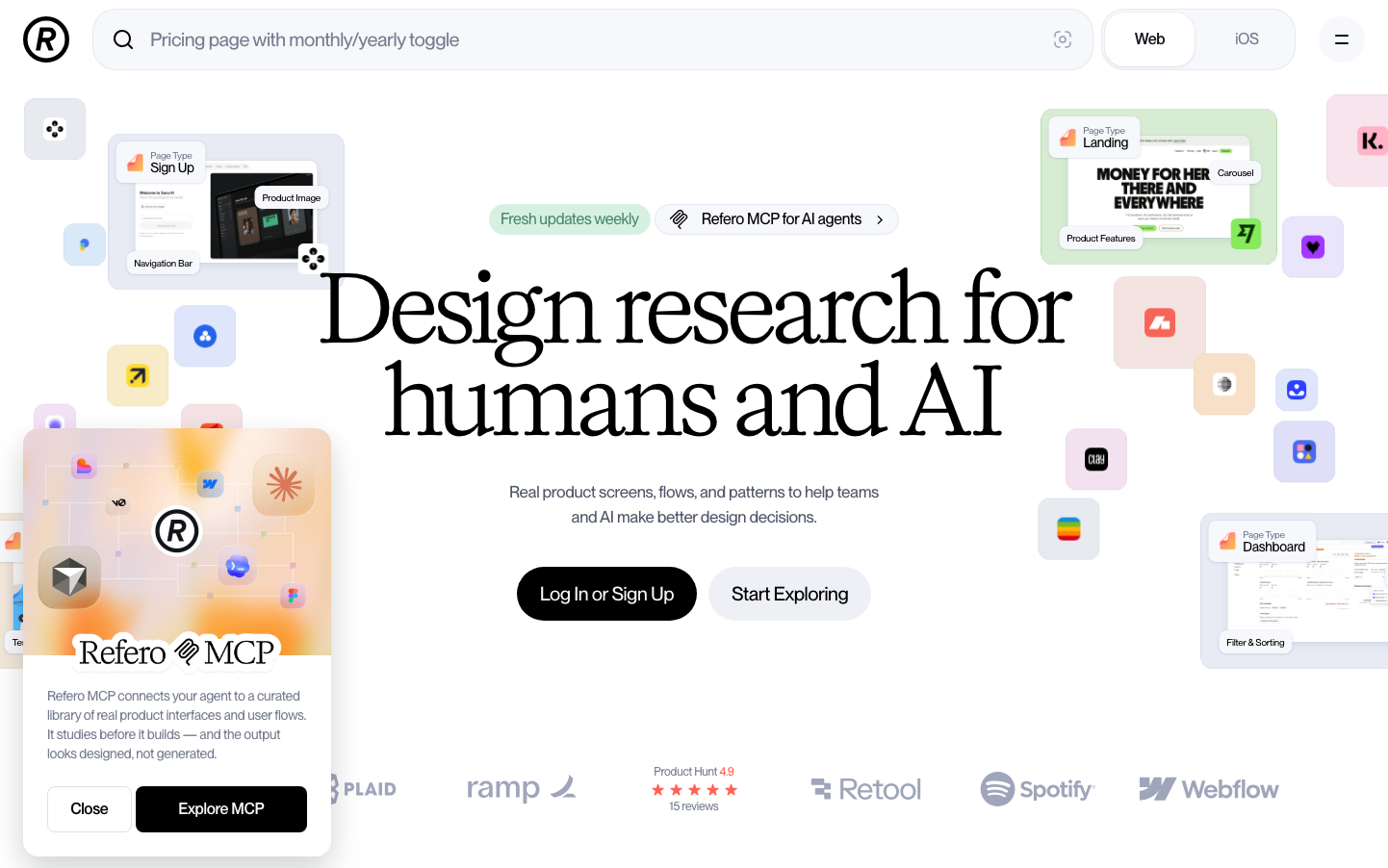
DesignRefero embodies sophisticated design intelligence through massive editorial typography (96px headlines) and carefully orchestrated UI card fragments that float like design specimens. The brand feels like a premium design laboratory where human creativity meets AI precision, creating an atmosphere of professional curation and systematic exploration.
Design Identity
Signature Color
Research Black
#000000
authoritative design expertise and premium tool credibility
Visual Identity
Floating UI component cards scattered across the layout like design specimens in a research lab, combined with dramatically oversized serif headlines that dominate the visual hierarchy
Component Style
Soft rounded cards (12-16px radius) with subtle shadows that feel like floating design artifacts. Clean containment with gentle elevation rather than hard borders - everything feels curated and touchable.
Spacing Philosophy
Generous breathing room around hero content with tight 8-12px clustering of related UI elements. Cards float with ample negative space while internal content maintains intimate proximity.
Design Principles
- Headlines use massive 96px serif typography for editorial authority
- Body text locked at 16-20px with 500 weight for consistent readability
- Cards use 12-16px border radius with soft shadows, never hard borders
- UI specimens float with 24-32px minimum separation
- Black buttons use full 24px+ border radius for pill-like comfort
Target Audience
Senior product designers and design researchers who need systematic access to real UI patterns and want tools that respect their craft expertise
Mood
Design descriptions are AI-generated based on visual analysis and may not fully reflect the brand's official design guidelines.
Design System
Typography Scale
| Element | Font | Size | Weight | Line Height |
|---|---|---|---|---|
| body | 16px | 500 | 24px | |
| h1 | 96px | 400 | 96px | |
| h2 | 17px | 500 | 26px | |
| a | 16px | 500 | 24px | |
| button | 20px | 500 | 28px | |
| input | 20px | 500 | 28px |
Color Palette
No colors extracted