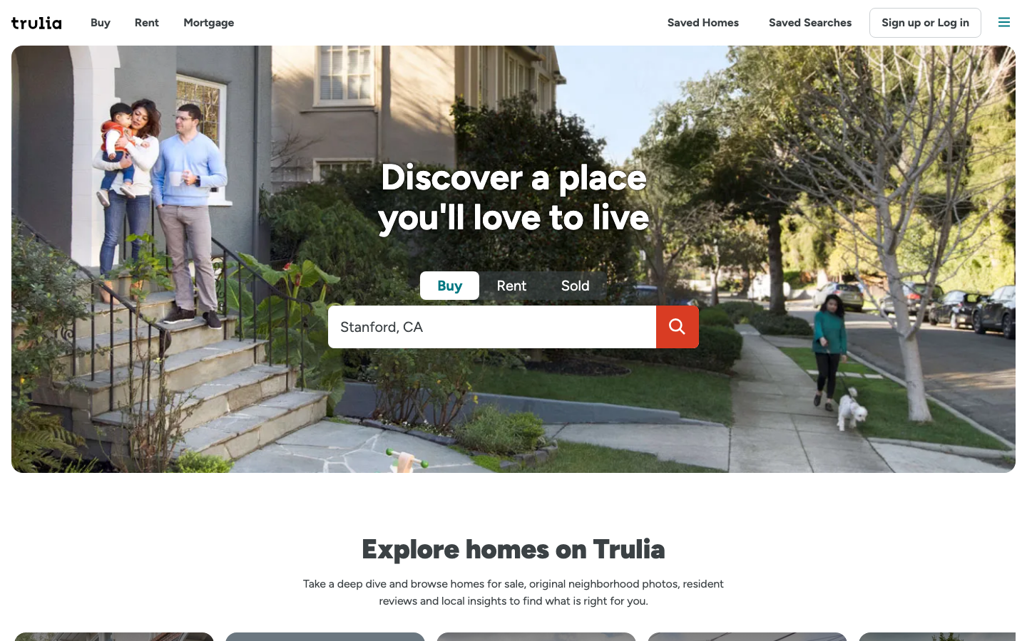
Help us build this. Leave comments, suggest improvements, and help create better design documentation for agents.
QuintoAndar
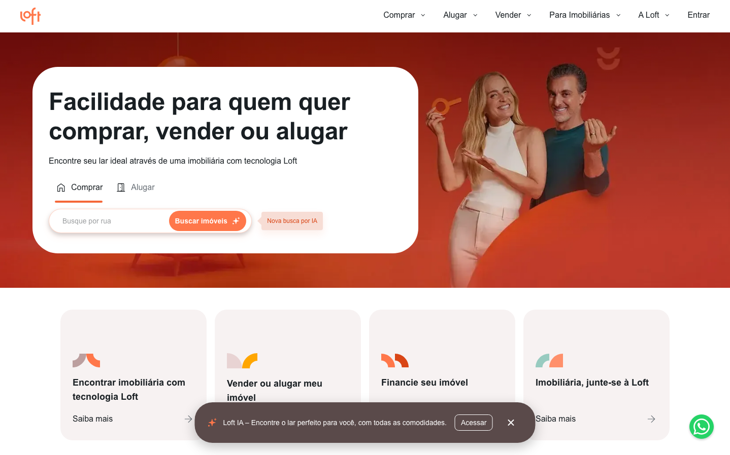
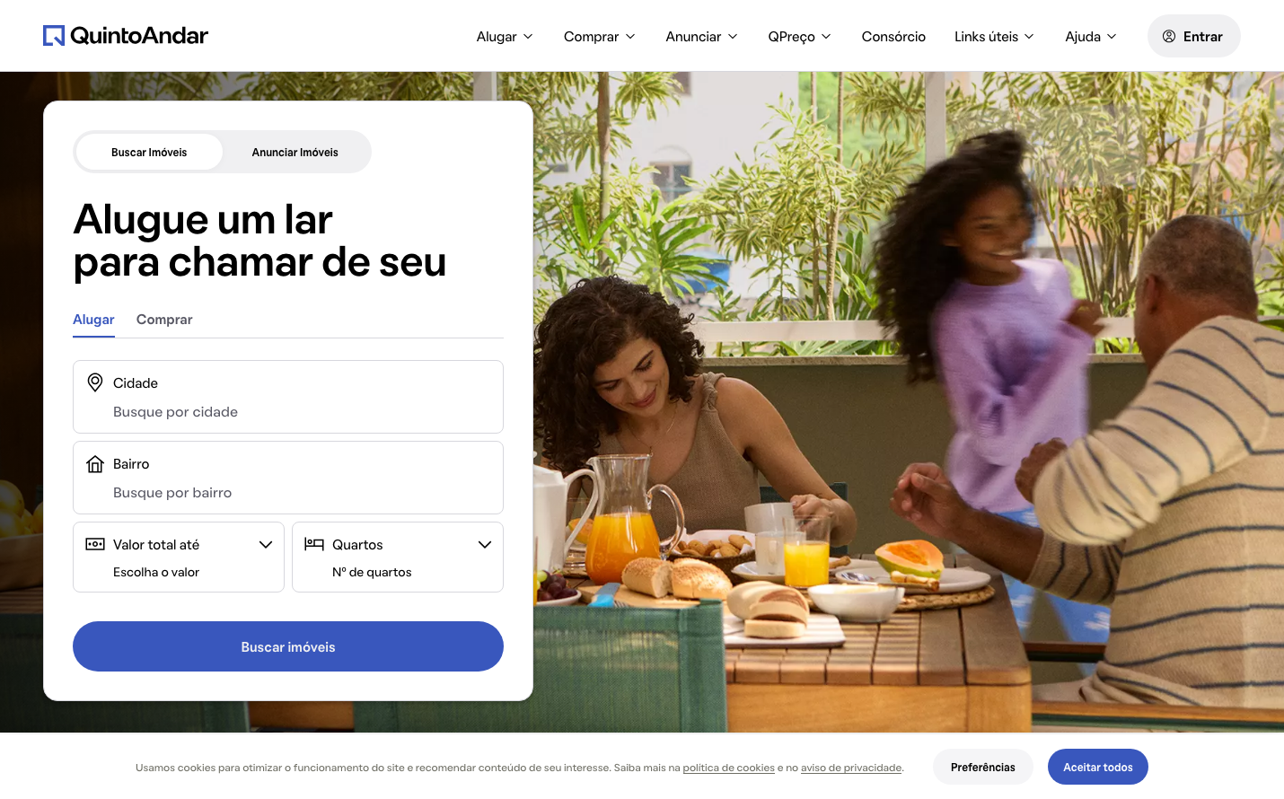
ProptechQuintoAndar's brand aesthetic blends human warmth with digital sophistication, using 'Oatmeal' typography to soften hard tech edges while maintaining trust through professional blue tones. The visual language suggests premium real estate experiences that feel both accessible and aspirational, creating intimacy around life's biggest decisions.
Design Identity
Signature Color
QuintoAndar Navy
#001755
Deep trust and real estate stability - the anchor color that communicates financial security in property decisions
Visual Identity
Generous rounded corners (24px+) paired with the distinctive 'Oatmeal' typeface create an immediately recognizable softness that humanizes real estate technology. The split-tab interface design and warm lifestyle photography overlay distinguishes it from sterile property platforms.
Component Style
Soft, approachable components with 8px input borders and 24px large radius buttons. Cards float with subtle shadows, never harsh borders. The 'Buscar imóveis' primary button uses pill-shaped corners (nearly circular) suggesting endless possibilities rather than rigid constraints.
Spacing Philosophy
Breathing room prioritizes user comfort - 12px button padding creates touchable targets while generous form spacing (likely 16-24px gaps) prevents overwhelming users during major life decisions. White space communicates luxury without intimidation.
Design Principles
- Border radius scales dramatically: 8px inputs, 16px medium components, 24px+ for primary actions
- Typography uses only Oatmeal family across all elements for brand consistency
- Button padding standardized at 12px vertical for tactile consistency
- Shadows are subtle and diffused (16px blur) never harsh or dramatic
- Colors maintain high contrast ratios while feeling warm and approachable
Target Audience
Brazilian urban professionals and families navigating major housing decisions who value both digital efficiency and human touch in real estate transactions
Mood
Design descriptions are AI-generated based on visual analysis and may not fully reflect the brand's official design guidelines.
Design System
Typography Scale
| Element | Font | Size | Weight | Line Height |
|---|---|---|---|---|
| body | 15px | 400 | 22.5px | |
| h1 | 47.36px | 600 | 47.36px | |
| h2 | 47.36px | 600 | 47.36px | |
| h3 | 36px | 600 | 36px | |
| h4 | 20px | 400 | 24px | |
| p | 15px | 600 | 24px | |
| a | 15px | 400 | 22.5px | |
| button | 15px | 400 | 24px | |
| input | 16px | 400 | 8px | |
| nav | 15px | 400 | 22.5px |
Color Palette
#f0f0f2#000000#3552b5#b9b9c3#d7d7dd#fff8e6#575763#e6e6e6#9595a4#dbf0da#001755#e4e4e8