Help us build this. Leave comments, suggest improvements, and help create better design documentation for agents.
Postman
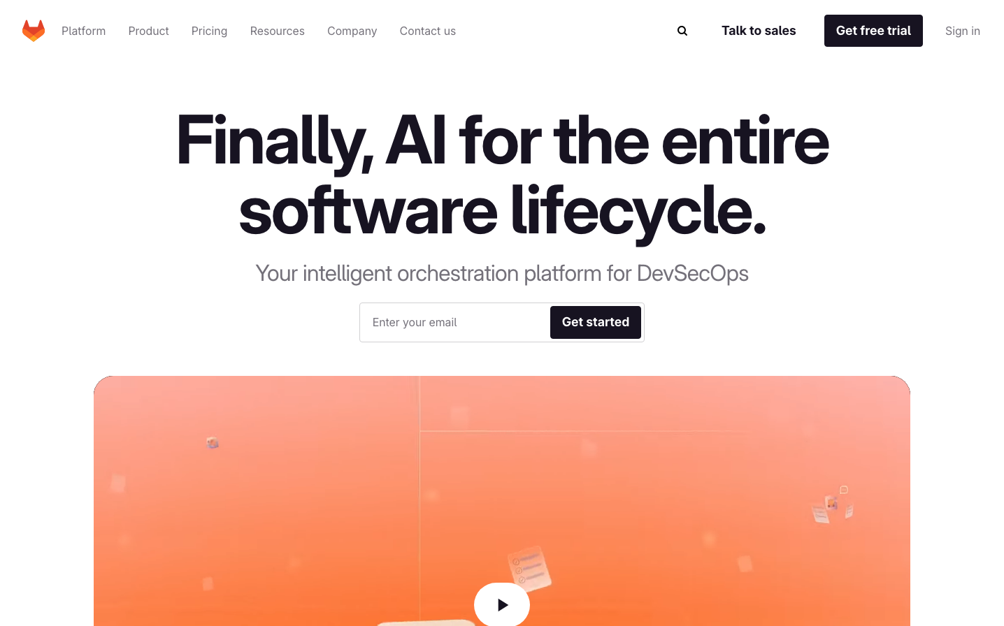
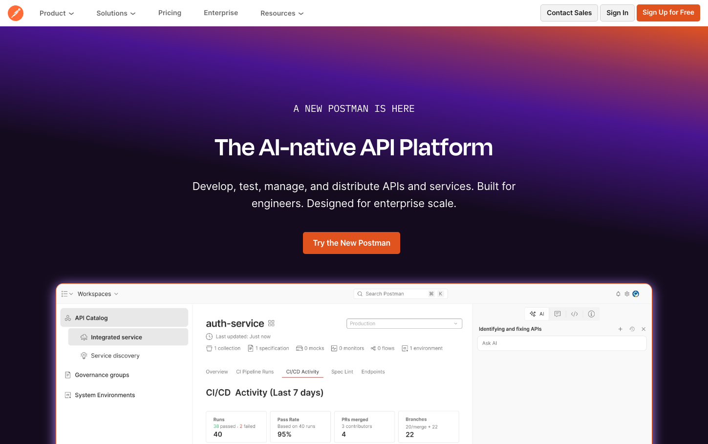
Dev ToolsPostman's brand radiates cosmic developer confidence through its electric purple-to-orange gradient hero backdrop that feels like coding at 3AM under neon lights. The typography hierarchy is deliberately stark - massive 55px Degular headlines command attention while 16px Inter body text whispers technical precision, creating a premium developer tool aesthetic that's equal parts approachable and sophisticated.
Design Identity
Signature Color
Postman Cosmic Orange
#FF6C37
Developer energy and API innovation - the warm counterpoint to deep purple that signals accessible power tools for technical creators
Visual Identity
The dramatic purple-to-orange gradient backgrounds paired with floating interface previews - it's immediately recognizable as a developer platform that takes visual design seriously while maintaining technical credibility.
Component Style
Clean rectangular cards with subtle shadows (0 8px 16px -4px #00000014) and 5-10px border radius. Buttons are solid with 600 weight Inter text, no heavy borders. Everything feels substantial but not bulky - like premium developer tooling should.
Spacing Philosophy
Generous hero section breathing room with tight, purposeful component spacing. The interface preview dominates the lower half while text floats in carefully orchestrated whitespace above - creating premium software showcase rhythm.
Design Principles
- Border radius stays between 5-20px - never sharp, never pill-shaped
- Typography uses exactly 3 families: Degular for headlines (55px/600), Inter for UI (14-16px), system-ui for body
- Shadows are subtle and consistent: 0 8px 16px with 14% opacity
- Gradients flow from deep purple (#4A148C) to electric orange (#FF6C37)
- All buttons use 600 font weight with 21px line height for chunky confidence
Target Audience
Senior engineers and technical leaders who expect their tools to be as visually sophisticated as they are functionally powerful - developers who appreciate craft in both code and interface design.
Mood
Design descriptions are AI-generated based on visual analysis and may not fully reflect the brand's official design guidelines.
Design System
Typography Scale
| Element | Font | Size | Weight | Line Height |
|---|---|---|---|---|
| body | 16px | 400 | 18.4px | |
| h1 | 55px | 600 | 49.5px | |
| h2 | 55px | 600 | 50px | |
| p | 14px | 600 | 16.1px | |
| a | 16px | 400 | 18.4px | |
| button | 14px | 600 | 21px | |
| nav | 16px | 400 | 18.4px | |
| footer | 16px | 400 | 18.4px | |
| main | 16px | 400 | 18.4px |
Color Palette
#ffffff#707070#212121#0056b3#000000#303030