Help us build this. Leave comments, suggest improvements, and help create better design documentation for agents.
PlanetScale
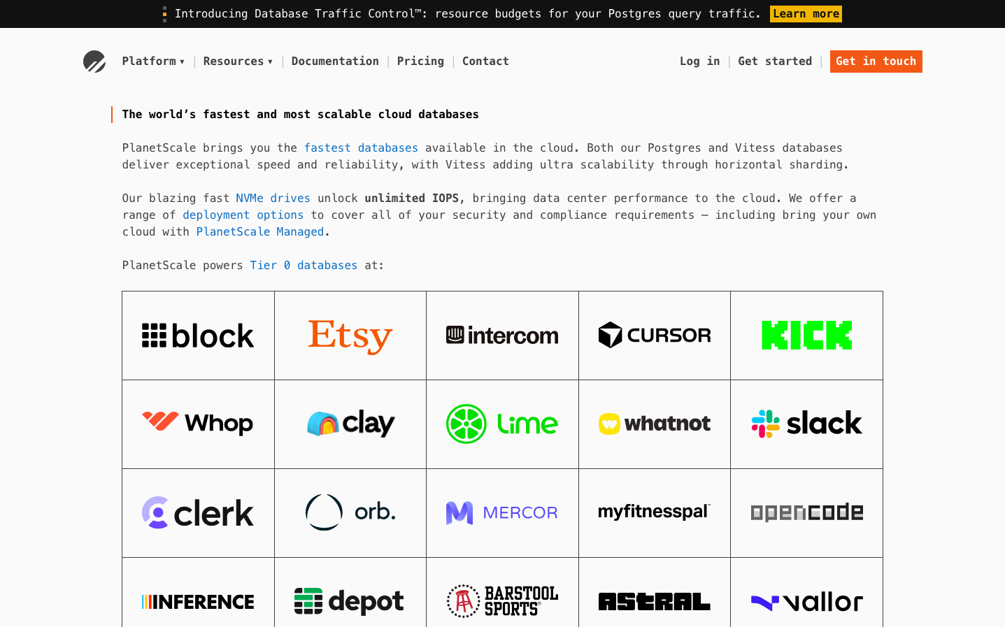
Dev ToolsPlanetScale embodies terminal-native precision with its monospace typography creating a developer-first aesthetic that feels like sophisticated command-line tooling. The signature purple (#a18bf5) against stark whites and blacks evokes the mystique of database magic happening behind clean interfaces.
Design Identity
Signature Color
Database Purple
#a18bf5
technical sophistication meets approachable magic - the color of powerful infrastructure made simple
Visual Identity
Wall-to-wall monospace typography that makes every element feel like executable code - even marketing copy reads like documentation, creating an unmistakably developer-centric brand.
Component Style
Minimal buttons with subtle rounded corners and no heavy shadows - everything feels like terminal commands with just enough polish. Orange accent buttons (#ff6b35) provide urgent CTAs against the monochromatic base.
Spacing Philosophy
Terminal-inspired spacing with consistent line heights of 24px creating readable code-like rhythm. Generous whitespace between sections mimics the breathing room of well-formatted code blocks.
Design Principles
- Every text element uses monospace - no exceptions, even for marketing copy
- Font weight only varies between 400 (regular) and 700 (bold) - no intermediate weights
- All typography locked to 16px with 24px line height for terminal consistency
- Purple backgrounds (#a18bf5) reserved for highlighting key technical concepts
- Orange (#ff6b35) exclusively for primary actions and urgent CTAs
Target Audience
Senior backend developers and DevOps engineers who appreciate tools that feel native to their terminal workflow and value technical precision over marketing polish
Mood
Design descriptions are AI-generated based on visual analysis and may not fully reflect the brand's official design guidelines.
Design System
Typography Scale
| Element | Font | Size | Weight | Line Height |
|---|---|---|---|---|
| body | 16px | 400 | 24px | |
| h1 | 16px | 700 | 24px | |
| h2 | 16px | 700 | 24px | |
| p | 16px | 400 | 24px | |
| a | 16px | 600 | 24px | |
| button | 16px | 600 | 24px | |
| nav | 16px | 400 | 24px | |
| header | 16px | 400 | 24px | |
| footer | 16px | 400 | 24px | |
| main | 16px | 400 | 24px |
Color Palette
#fafafa#ebebeb#b7a5fb#ffffff#111111#effff3#d4c9fe#a18bf5#13862e