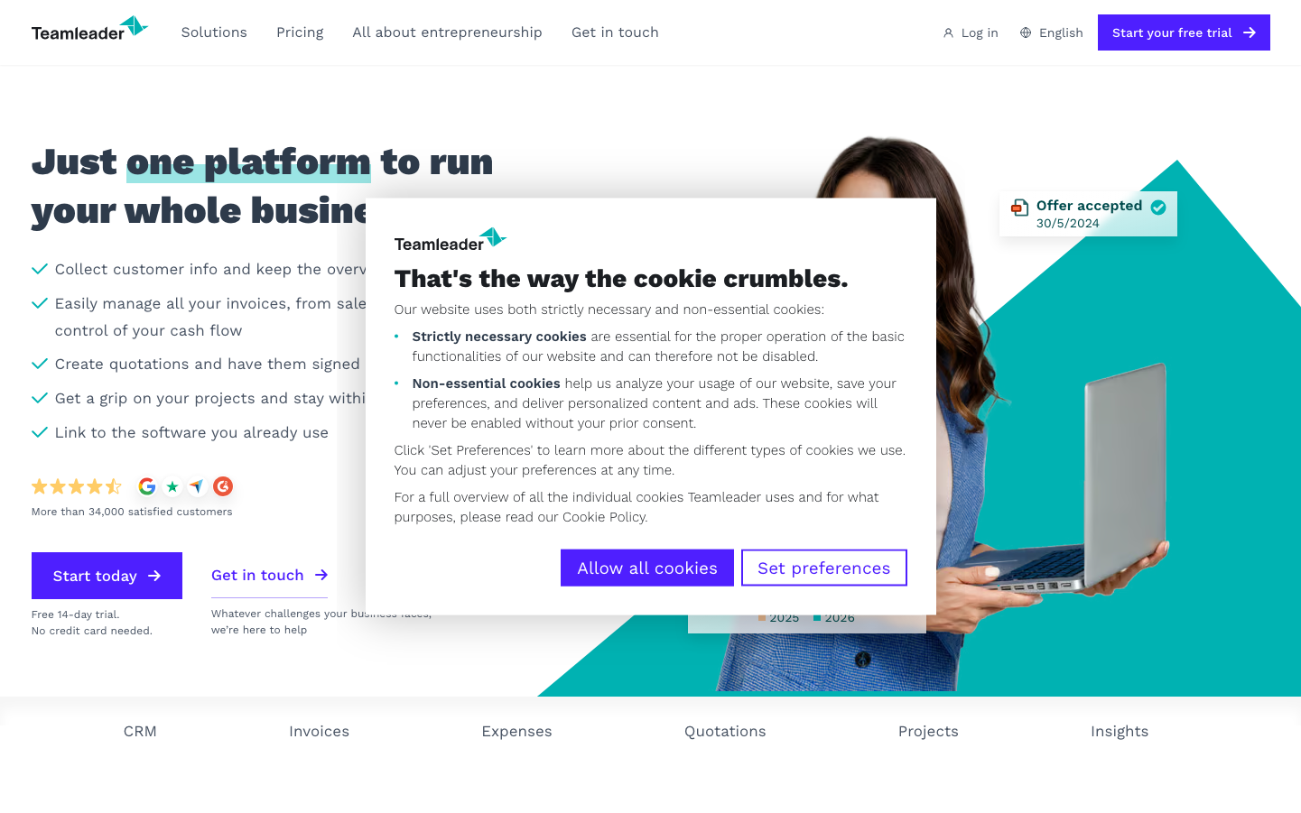
Help us build this. Leave comments, suggest improvements, and help create better design documentation for agents.
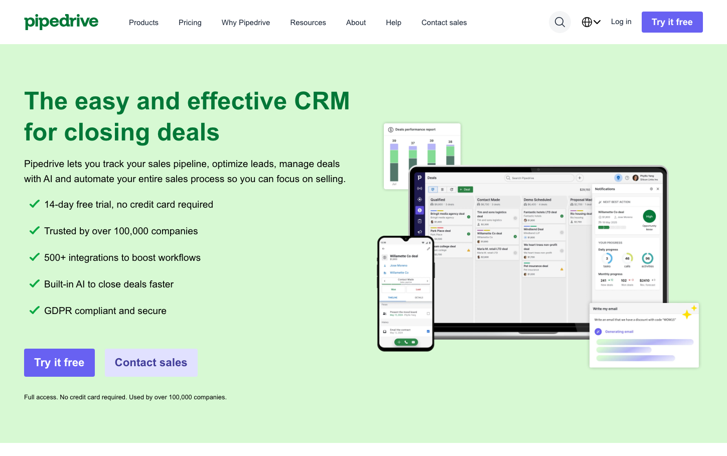
Pipedrive
CRMPipedrive's brand aesthetic combines professional warmth with approachable sophistication through a signature emerald-green palette that feels both trustworthy and energizing. The typography hierarchy uses Haffer for bold headlines paired with Inter for clarity, creating a confident yet accessible voice that speaks to growth-focused sales professionals.
Design Identity
Signature Color
Pipedrive Emerald
#28a745
Growth-driven sales success and trustworthy prosperity
Visual Identity
The distinctive combination of emerald-green CTA buttons against soft mint-green backgrounds, paired with multi-device mockups showing real CRM interfaces creates an immediately recognizable 'sales-focused productivity' aesthetic.
Component Style
Rounded corners with 8px radius create friendly approachability, while solid buttons without borders emphasize action-oriented confidence. Cards and interfaces use subtle shadows and clean white backgrounds for professional clarity.
Spacing Philosophy
Generous vertical rhythm with approximately 48px between major sections creates breathing room that reduces cognitive load, while tight 16px internal spacing keeps related elements cohesively grouped for scanning efficiency.
Design Principles
- Border radius consistently uses 8px for buttons and cards
- Green checkmarks always accompany feature lists for positive reinforcement
- Device mockups show actual product interfaces, never generic placeholders
- Headlines use bold 52px Haffer, body text stays at 16px Inter
- CTAs use solid emerald backgrounds, never outlines or gradients
Target Audience
Sales managers and business development professionals at growing companies who need powerful CRM functionality without enterprise complexity
Mood
Design descriptions are AI-generated based on visual analysis and may not fully reflect the brand's official design guidelines.
Design System
Typography Scale
| Element | Font | Size | Weight | Line Height |
|---|---|---|---|---|
| body | 16px | 400 | normal | |
| h1 | 52px | 700 | 62px | |
| h2 | 36px | 700 | 43px | |
| h3 | 30px | 700 | 36px | |
| p | 16px | 400 | normal | |
| a | 16px | 600 | normal | |
| button | 16px | 400 | normal | |
| input | 14px | 400 | 25px | |
| nav | 16px | 400 | normal | |
| header | 16px | 400 | normal |
Color Palette
#93949a#ffffff#3997ce#a9abaf#754cc0#1a1a4e#ffab00#b21019#815dc5#ec7c75#eaad06#dddede