Help us build this. Leave comments, suggest improvements, and help create better design documentation for agents.
Pepsi
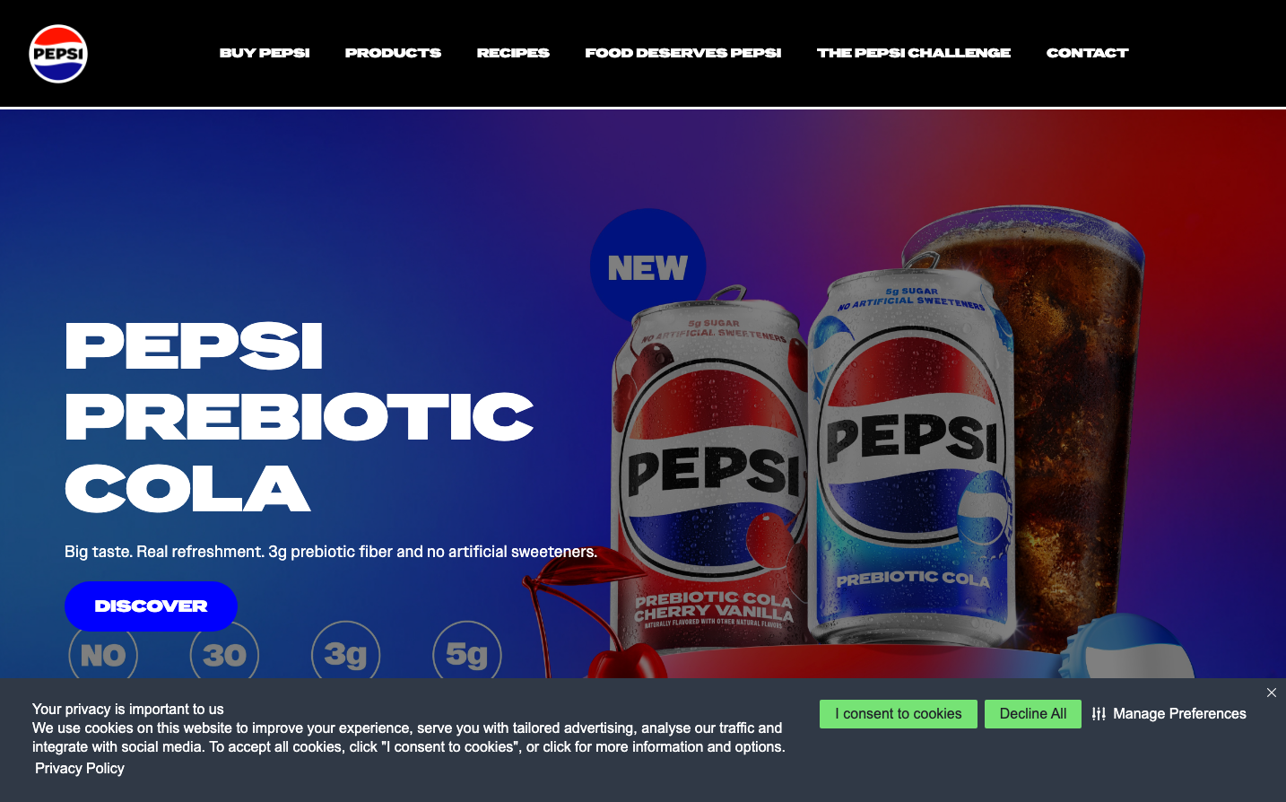
BeveragesPepsi's brand identity radiates bold, energetic nostalgia through an electrifying gradient that transitions from deep royal blue to vibrant red, creating a sense of dynamic movement and youthful rebellion. The ultra-condensed, geometric 'pepsi-owner-extended' typography delivers aggressive confidence with razor-sharp letterforms that feel like they're carved from metal, while the dramatic product photography against the gradient backdrop creates an almost cinematic, larger-than-life presence.
Design Identity
Signature Color
Pepsi Royal Blue
#0052CC
Bold confidence and refreshing energy that bridges tradition with innovation
Visual Identity
The dramatic blue-to-red diagonal gradient backdrop combined with ultra-condensed, geometric typography creates an unmistakable sense of kinetic energy and bold confidence that feels uniquely Pepsi.
Component Style
Components feel solid and substantial with moderate 5-10px border radius creating approachable but confident edges. The 'DISCOVER' button uses bold blue with generous padding, emphasizing substance over subtlety. Everything has weight and presence rather than delicate minimalism.
Spacing Philosophy
Bold, generous spacing with dramatic scale jumps - large product imagery dominates the frame with ample breathing room, while text elements use confident line-heights (25.6px for body, 79.2px for headers) that create rhythm through dramatic size contrasts rather than subtle intervals.
Design Principles
- Headers use only 'pepsi-owner-extended' at massive scales (72px, 60px, 24px) for maximum impact
- Border radius stays conservative between 2px-10px, never exceeding moderate curves
- Typography weight remains at 400-500, relying on scale rather than boldness for hierarchy
- Body text uses Arial fallback for reliability while headers get custom brand fonts
- Line-height ratios stay tight (1.1x) for headers, looser (1.6x) for body text
Target Audience
Bold, confident consumers who value authentic taste and aren't afraid to stand out - people who choose based on flavor and heritage rather than trends
Mood
Design descriptions are AI-generated based on visual analysis and may not fully reflect the brand's official design guidelines.
Design System
Typography Scale
| Element | Font | Size | Weight | Line Height |
|---|---|---|---|---|
| body | 16px | 400 | 25.6px | |
| h1 | 72px | 500 | 79.2px | |
| h2 | 60px | 500 | 66px | |
| h3 | 24px | 500 | 30px | |
| h5 | 24px | 500 | 30px | |
| p | 16px | 400 | 21px | |
| a | 16px | 400 | 21px | |
| button | 20px | 400 | 20px | |
| nav | 16px | 400 | 25.6px | |
| header | 16px | 400 | 25.6px |
Color Palette
#ff3333#cc0000#990000#660000#330000#ff0000#eaf3ff#d5e7ff#f1f1f1#e3e3e3#d4d4d4#c6c6c6