Help us build this. Leave comments, suggest improvements, and help create better design documentation for agents.
Page Flows
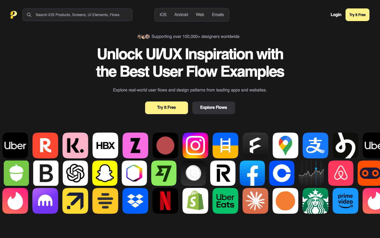
DesignPage Flows embraces a sophisticated dark academia aesthetic with golden yellow accents that evoke creativity and premium tool mastery. The Geist typography creates a technical yet approachable personality, while the vast grid of colorful app icons suggests comprehensive industry knowledge and cross-platform expertise.
Design Identity
Signature Color
Workflow Gold
#F4D03F
Creative illumination and premium UX intelligence - the color of insights and breakthrough moments
Visual Identity
The distinctive wall of meticulously arranged app icons creates an instant visual signature - like a designer's trophy case showcasing mastery across the entire digital ecosystem.
Component Style
Buttons feature generous rounded corners (12-16px radius) with substantial padding that feels premium and touchable. The golden primary button has a warm glow effect while secondary buttons maintain subtle gray transparency with clean edges.
Spacing Philosophy
Generous 80px+ vertical spacing creates breathing room around key messaging, while the icon grid uses tight 8px gaps to create density and showcase breadth of coverage. Hero section uses dramatic scale jumps from 20px body text to 60px headlines.
Design Principles
- Headlines never exceed 60px but maintain 700 weight for impact
- Golden yellow (#F4D03F) is reserved exclusively for primary actions
- Icon grids use 64x64px squares with 8px gaps for maximum density
- Dark backgrounds (#1a1a1a) provide 90%+ of surface area
- Button border radius stays between 12-16px for friendly approachability
Target Audience
Senior product designers and UX researchers who need comprehensive workflow references and value curated, professional-grade design pattern libraries
Mood
Design descriptions are AI-generated based on visual analysis and may not fully reflect the brand's official design guidelines.
Design System
Typography Scale
| Element | Font | Size | Weight | Line Height |
|---|---|---|---|---|
| body | 16px | 400 | 24px | |
| h1 | 57px | 700 | 66px | |
| h2 | 44px | 600 | 55px | |
| h4 | 28px | 600 | 40px | |
| h5 | 16px | 700 | 24px | |
| h6 | 14px | 700 | 20px | |
| p | 14px | 400 | 21px | |
| a | 16px | 400 | 24px | |
| button | 16px | 400 | 24px | |
| input | 14px | 400 | normal |
Color Palette
#ffffff