Help us build this. Leave comments, suggest improvements, and help create better design documentation for agents.
Oyo
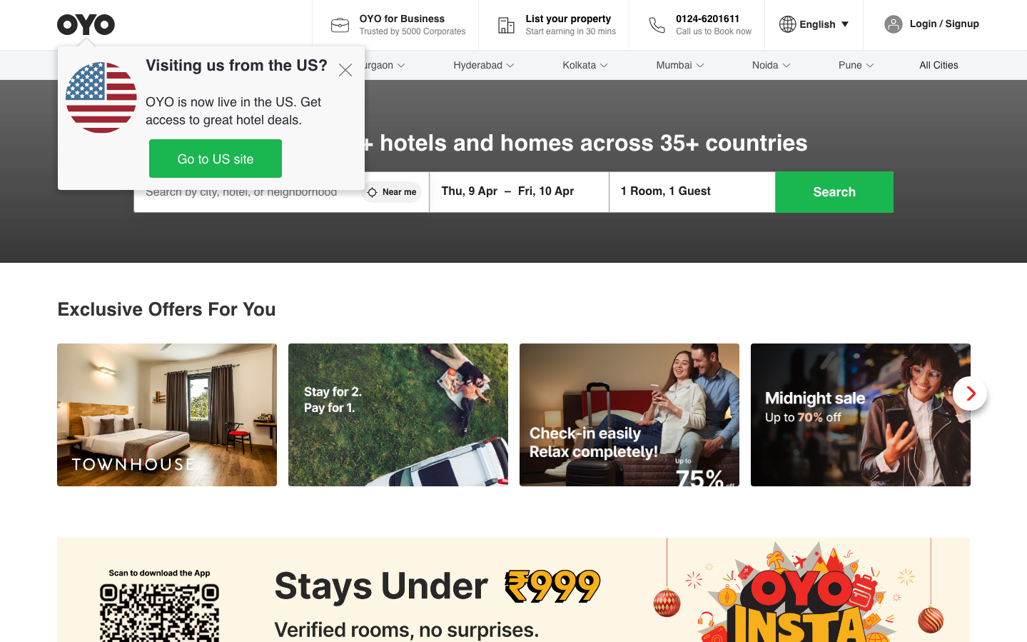
TravelOYO's brand aesthetic balances accessibility with aspiration through a vibrant emerald green signature that pulses against clean white interfaces. The typography hierarchy using Inter creates approachable sophistication, while promotional cards layer rich imagery with bold overlays to suggest affordable luxury across diverse travel experiences.
Design Identity
Signature Color
OYO Emerald
#00C851
Growth, accessibility, and trust in budget hospitality - a welcoming green that suggests both affordability and quality assurance
Visual Identity
Large hero search interface with bright emerald CTAs and a distinctive mix of lifestyle photography cards with bold text overlays - the layout screams 'travel booking platform' through its prominent date/guest selectors and promotional tile grid
Component Style
Rounded corners (8-12px) with clean edges, no heavy shadows. Cards use subtle elevation with rich photographic backgrounds and bold white/colored text overlays. Buttons are substantial with medium padding and confident green fills.
Spacing Philosophy
Generous hero sections with breathing room, followed by tight promotional grids that maximize content density. The search bar gets premium real estate while cards pack efficiently below to showcase variety.
Design Principles
- Primary actions always use the signature emerald green
- Photography cards must have high-contrast text overlays
- Search functionality gets hero treatment with maximum visual priority
- Border radius stays consistent at 8-12px across all components
- Typography uses only Inter with clear weight hierarchy (400, 600, 700, 800)
Target Audience
Budget-conscious millennials and Gen-Z travelers who want reliable accommodations without sacrificing style or digital convenience
Mood
Design descriptions are AI-generated based on visual analysis and may not fully reflect the brand's official design guidelines.
Design System
Typography Scale
| Element | Font | Size | Weight | Line Height |
|---|---|---|---|---|
| body | 16px | 400 | 19.2px | |
| h1 | 32px | 800 | 48px | |
| h2 | 14px | 400 | 16.8px | |
| h3 | 26px | 700 | 31.2px | |
| p | 16px | 400 | 24px | |
| a | 16px | 400 | 19.2px | |
| button | 18px | 600 | 20.7px | |
| input | 16px | 600 | 16px |
Color Palette
No colors extracted