Help us build this. Leave comments, suggest improvements, and help create better design documentation for agents.
OutSystems
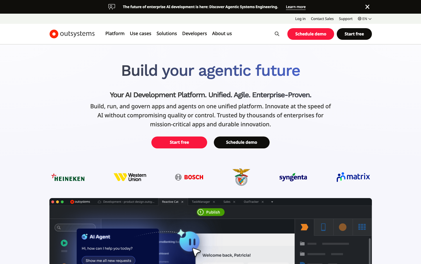
Low-CodeOutSystems presents a confident enterprise AI platform identity with striking red accent colors that demand attention against clean, minimal layouts. The typography hierarchy uses Work Sans for headings creating authoritative presence, while the generous whitespace and strategic color placement communicates premium enterprise software with approachable accessibility.
Design Identity
Signature Color
OutSystems Crimson
#FF2D55
Bold enterprise innovation and urgent competitive advantage
Visual Identity
Dramatic red pill-shaped buttons floating in expansive white space with heavyweight typography that commands executive attention
Component Style
Fully rounded pill-shaped buttons with bold red fills, no borders or shadows. Clean geometric elements with generous padding that feels substantial and executive-grade. Everything is soft-edged and approachable despite the enterprise positioning.
Spacing Philosophy
Luxurious breathing room with massive 80px+ vertical gaps between sections. Hero areas use cathedral-like proportions while maintaining intimate 16px-24px component padding for readability.
Design Principles
- Primary CTAs always use full pill radius (24px+) for maximum visual impact
- Red accent color reserved exclusively for primary actions and brand elements
- Typography hierarchy jumps dramatically: 54px headlines to 18px body with no intermediate sizes
- Enterprise logos displayed in single row at consistent 60px height
- Background remains pure white to maximize color contrast and perceived premium positioning
Target Audience
Enterprise CTOs and senior developers seeking rapid AI application development without coding complexity
Mood
Design descriptions are AI-generated based on visual analysis and may not fully reflect the brand's official design guidelines.
Design System
Typography Scale
| Element | Font | Size | Weight | Line Height |
|---|---|---|---|---|
| body | 18px | 500 | 27.9px | |
| h1 | 54px | 500 | 64.8px | |
| h2 | 39.6px | 500 | 47.52px | |
| h3 | 19.8px | 500 | 29.7px | |
| p | 14.4px | 700 | 15.4px | |
| a | 18px | 500 | 27.9px | |
| button | 12.6px | 400 | 21.9492px | |
| input | 14.4px | 500 | 22.32px | |
| nav | 18px | 500 | 28.044px | |
| header | 18px | 500 | 28.044px |
Color Palette
No colors extracted


