Help us build this. Leave comments, suggest improvements, and help create better design documentation for agents.
Obsidian
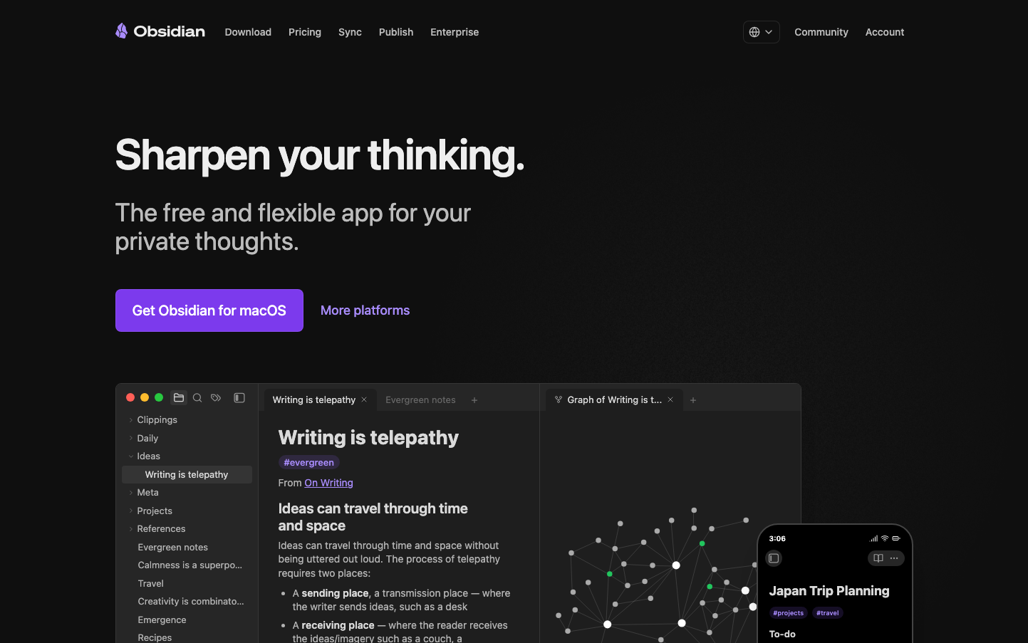
ProductivityObsidian embraces a sophisticated dark-mode aesthetic that feels like a midnight laboratory for deep thinkers. The signature purple creates an intellectual mystique, while the spacious layout and large typography convey confidence in handling complex ideas.
Design Identity
Signature Color
Obsidian Amethyst
#a882ff
cerebral creativity and nocturnal productivity - the color of minds that work best in darkness
Visual Identity
The dramatic dark background combined with a distinctive node-graph visualization and generous whitespace creates an unmistakable 'digital mind palace' aesthetic that screams premium knowledge management.
Component Style
Subtly rounded corners with gentle gradients and no harsh borders - everything feels organic and brain-like. The primary button has a smooth 8px radius with a vibrant purple fill, while the interface elements blend seamlessly into the dark canvas.
Spacing Philosophy
Luxuriously spacious with massive 48px+ gaps between major sections, creating a sense of intellectual breathing room. The layout prioritizes contemplative space over information density.
Design Principles
- Typography scales dramatically: 60px headlines, 36px body text for maximum readability
- Dark backgrounds dominate with selective bright accent colors
- Border radius stays consistent at 8px for interactive elements
- Node graphs use organic positioning rather than rigid grids
- Purple (#a882ff) serves as the primary interactive color throughout
Target Audience
Knowledge workers, researchers, and creative professionals who think in networks and connections rather than linear documents - people who work late hours and prefer dark interfaces
Mood
Design descriptions are AI-generated based on visual analysis and may not fully reflect the brand's official design guidelines.
Design System
Typography Scale
| Element | Font | Size | Weight | Line Height |
|---|---|---|---|---|
| body | 16px | 400 | 24px | |
| h1 | 60px | 600 | 60px | |
| h2 | 60px | 600 | 60px | |
| p | 36px | 400 | 40px | |
| a | 16px | 400 | 24px | |
| button | 14px | 400 | 20px | |
| input | 14px | 400 | 20px | |
| header | 16px | 400 | 24px | |
| footer | 16px | 400 | 24px |
Color Palette
#fb464c#e9973f#e0de71#44cf6e#53dfdd#027aff#a882ff#fa99cd#404040#000000#ffffff#f8fafc