Help us build this. Leave comments, suggest improvements, and help create better design documentation for agents.
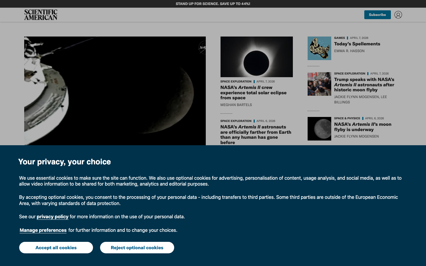
The New York Times
MediaThe New York Times embodies authoritative journalism through its iconic serif typography and dense, information-rich layout. The design balances gravitas with accessibility, using a sophisticated mix of Times serif for headlines and Franklin Gothic for body text, creating a distinctly editorial hierarchy that commands respect.
Design Identity
Signature Color
NYT Editorial Black
#000000
Journalistic authority and timeless credibility - the color of definitive news
Visual Identity
The distinctive gothic masthead typography combined with dense, newspaper-style column layouts and minimal button styling creates an unmistakable editorial aesthetic that prioritizes content hierarchy over flashy design elements.
Component Style
Ultra-minimal buttons with sharp corners, no visible shadows or borders - everything feels purposefully understated. Interactive elements are distinguished by typography weight rather than visual decoration, maintaining editorial focus.
Spacing Philosophy
Newspaper-tight spacing with 12.5px bottom margins and 20px right gutters creates information density. The layout maximizes content per screen while maintaining readability through careful typographic hierarchy.
Design Principles
- Typography hierarchy uses serif Times for headlines, sans-serif Franklin for UI
- Button styling relies on font weight (700) rather than visual decoration
- Margins follow newspaper conventions: 12.5px bottom, 20px right, 25px top
- Color palette emphasizes muted editorial tones over bright accent colors
- Layout prioritizes content density over generous whitespace
Target Audience
Educated news consumers who value journalistic credibility and comprehensive coverage over entertainment-driven media
Mood
Design descriptions are AI-generated based on visual analysis and may not fully reflect the brand's official design guidelines.
Design System
Typography Scale
| Element | Font | Size | Weight | Line Height |
|---|---|---|---|---|
| body | 16px | 400 | 16px | |
| h1 | 16px | 400 | 16px | |
| h2 | 16px | 400 | 16px | |
| h3 | 11px | 500 | 20px | |
| p | 13px | 500 | 18px | |
| a | 11px | 700 | 11px | |
| button | 11px | 700 | 11px | |
| nav | 16px | 400 | 16px | |
| header | 16px | 400 | 16px | |
| footer | 11px | 400 | 11px |
Color Palette
#e9f5d7#87550b#333333#de7f0b#727272#daf1f7#5a8d9c#ffbaad#97a4ad#a3c7d1#ed991a#872e1c