Help us build this. Leave comments, suggest improvements, and help create better design documentation for agents.
Nubank
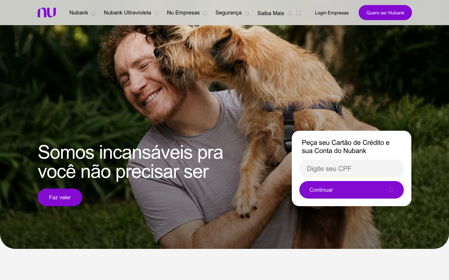
NeobankNubank's signature aesthetic balances warmth with technological sophistication through rich purple tones and humanized photography. The brand creates an approachable yet premium fintech experience that feels more like a lifestyle brand than traditional banking.
Design Identity
Signature Color
Nubank Ultravioleta
#854bcc
Progressive fintech innovation with human warmth - breaking traditional banking conventions
Visual Identity
Emotional lifestyle photography paired with vibrant purple gradients and pill-shaped buttons create an instantly recognizable anti-bank aesthetic that prioritizes human connection over corporate sterility.
Component Style
Soft, rounded components with generous pill-shaped buttons (high border radius) and minimal shadows. Everything feels approachable and friendly rather than sharp or corporate - buttons are plump and inviting, forms have gentle curves.
Spacing Philosophy
Generous breathing room with asymmetric layouts that feel organic rather than grid-locked. Large hero sections with ample whitespace create intimacy, while compact navigation maintains accessibility.
Design Principles
- Purple gradients dominate without overwhelming - used strategically for CTAs and accents
- Pill-shaped buttons with high border radius (24px+) for approachable feel
- Graphik Medium typography at 500 weight for friendly authority
- Lifestyle photography always features genuine emotion and natural lighting
- White cards with subtle shadows float over colored backgrounds
Target Audience
Young urban professionals aged 25-40 who distrust traditional banks and value transparency, simplicity, and human-centered financial services.
Mood
Design descriptions are AI-generated based on visual analysis and may not fully reflect the brand's official design guidelines.
Design System
Typography Scale
| Element | Font | Size | Weight | Line Height |
|---|---|---|---|---|
| body | 16px | 400 | 24px | |
| h1 | 56px | 500 | 61.6px | |
| h2 | 48px | 500 | 52.8px | |
| h3 | 36px | 500 | 43.2px | |
| p | 20px | 500 | 26px | |
| a | 14px | 500 | 21px | |
| button | 20px | 400 | 30px | |
| input | 16px | 400 | 24px | |
| header | 16px | 400 | 24px | |
| footer | 16px | 400 | 24px |
Color Palette
#000000#2a2a2a#610f9b#f4f4f4#eadbf1#e9dff6#490b75#ecd9ff#cacaca#414140#eaa950#a2a2a2