Help us build this. Leave comments, suggest improvements, and help create better design documentation for agents.
Nord Security
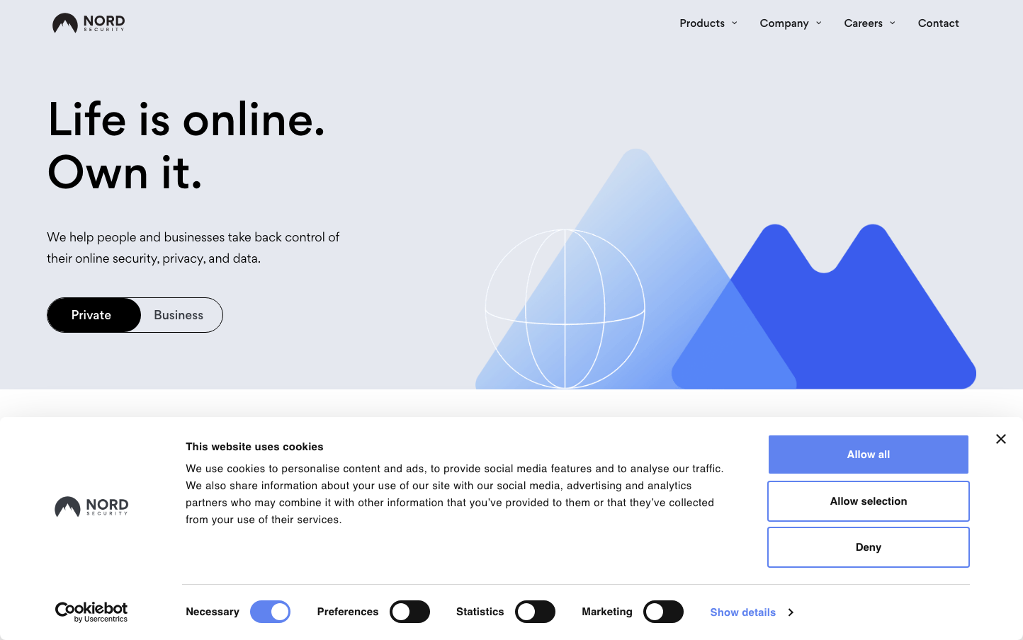
SecurityNord Security projects digital sovereignty through bold geometric mountains and ethereal blue gradients that suggest both protection and transparency. The oversized Gordita typography creates confident declarations while the layered mountain silhouettes communicate security layers and Nordic strength.
Design Identity
Signature Color
Nord Indigo
#4F46E5
digital trust and cybersecurity authority - deep enough to convey enterprise reliability, bright enough to feel approachable
Visual Identity
Layered geometric mountain silhouettes in gradient blues with a wireframe globe overlay - this mountain-tech metaphor is instantly recognizable and unique in the security space
Component Style
Pill-shaped buttons with generous rounded corners (24px+) and high contrast fills. The 'Private' button uses a distinctive black pill against light backgrounds, creating strong visual anchors. No visible shadows or borders - relies on solid color contrast.
Spacing Philosophy
Asymmetric layout with massive left-side text block and right-side illustration breathing room. Generous 40-60px gaps between headline elements, while the mountain graphic fills the remaining space completely - no wasted pixels.
Design Principles
- Headlines use 60px Gordita at 500 weight for maximum impact
- Body text maintains 18px with 27px line height for readability
- Button corners are fully rounded (pill shape) at ~24px radius
- Color palette limited to blues, black, and white for clarity
- Geometric shapes always use gradient fills, never flat colors
Target Audience
Privacy-conscious professionals and security-aware businesses who want enterprise-grade protection without technical complexity
Mood
Design descriptions are AI-generated based on visual analysis and may not fully reflect the brand's official design guidelines.
Design System
Typography Scale
| Element | Font | Size | Weight | Line Height |
|---|---|---|---|---|
| body | 18px | 400 | 27px | |
| h1 | 60px | 500 | 75px | |
| h2 | 22px | 500 | 30px | |
| h3 | 20px | 500 | 30px | |
| p | 15px | 400 | 24px | |
| a | 15px | 400 | 24px | |
| button | 15px | 400 | 24px | |
| input | 15px | 400 | 24px | |
| header | 18px | 400 | 27px | |
| main | 18px | 400 | 27px |
Color Palette
No colors extracted