Help us build this. Leave comments, suggest improvements, and help create better design documentation for agents.
Neon
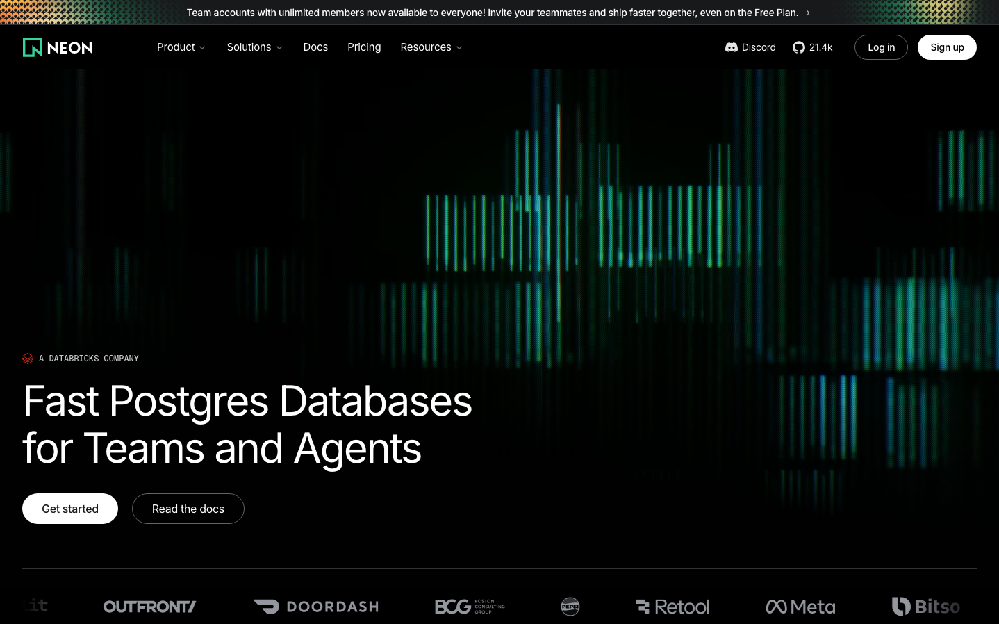
Dev ToolsNeon's brand exudes nocturnal developer energy through its signature electric green against deep black backgrounds, creating a Matrix-like aesthetic that speaks to late-night coding sessions. The typography uses Inter with dramatic scale jumps (60px headlines to 16px body) creating stark hierarchical contrasts that feel both technical and bold.
Design Identity
Signature Color
Neon Electric Green
#00E5B8
database vitality and performance - the color of data flowing at high speed
Visual Identity
Animated vertical bar charts with neon green gradients that pulse and flow like real-time database metrics, creating a living data visualization that immediately signals performance and speed.
Component Style
Buttons have generous rounded corners (approximately 24px) with clean fills and no visible borders or shadows. Everything feels smooth and approachable rather than sharp or technical, with a focus on substantial padding that creates confidence.
Spacing Philosophy
Minimal top navigation with dramatic negative space around the hero content, allowing the animated background to breathe. The layout uses asymmetrical left-alignment with the headline taking up roughly 40% of the viewport width, creating dynamic tension.
Design Principles
- Headlines use 400 font weight instead of bold for a softer, more approachable feel
- Dramatic font size jumps: 60px to 16px with no middle ground
- Pure black backgrounds (#000000) for maximum contrast
- Button corners are consistently rounded at 24px+
- Navigation stays minimal with only 5 core items
Target Audience
Backend developers and database engineers who work with Postgres at scale and value performance over marketing fluff
Mood
Design descriptions are AI-generated based on visual analysis and may not fully reflect the brand's official design guidelines.
Design System
Typography Scale
| Element | Font | Size | Weight | Line Height |
|---|---|---|---|---|
| body | 16px | 400 | 24px | |
| h1 | 60px | 400 | 67.5px | |
| h2 | 48px | 400 | 54px | |
| h3 | 16px | 500 | 24px | |
| h4 | 18px | 400 | 18px | |
| p | 24px | 500 | 24px | |
| a | 16px | 400 | 24px | |
| button | 15px | 400 | 22.5px | |
| nav | 16px | 400 | 24px | |
| header | 16px | 400 | 24px |
Color Palette
#ffffff#f9fafa