Help us build this. Leave comments, suggest improvements, and help create better design documentation for agents.
Neon
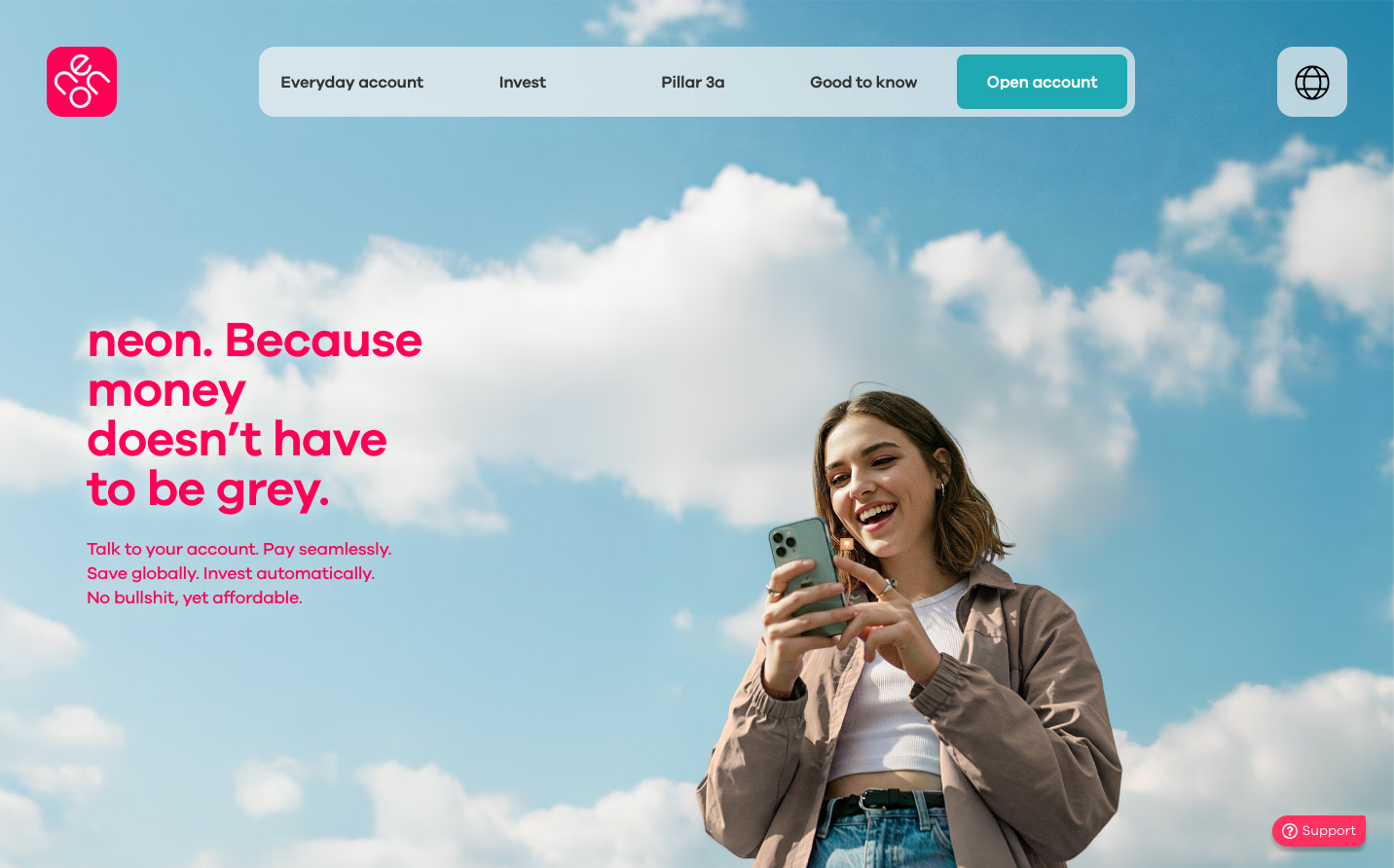
NeobankNeon radiates playful optimism through electric pink typography against dreamy cloud-filled skies, creating an anti-establishment banking aesthetic. The Galano Grotesque typeface delivers friendly authority while the vibrant magenta suggests banking that's accessible, transparent, and refreshingly human.
Design Identity
Signature Color
Neon Pink
#FF1757
disruptive financial transparency - bold, unapologetic, and refreshingly honest banking
Visual Identity
Electric pink typography floating against ethereal cloud photography - the juxtaposition of digital vibrancy against organic, dreamy backgrounds creates an instantly recognizable 'banking in the clouds' aesthetic
Component Style
Soft rounded corners with generous padding create approachable, pillow-like buttons. The teal CTA button contrasts beautifully with the pink branding, while maintaining friendly accessibility over harsh corporate edges.
Spacing Philosophy
Generous breathing room with the headline floating in negative space against clouds, creating an airy, aspirational feeling. Text blocks are tightly grouped for scanability while maintaining overall openness.
Design Principles
- Typography uses only Galano Grotesque family across all weights
- Headlines scale dramatically to 51px for maximum impact
- Color palette limited to signature pink, supporting teal, and natural photography
- Buttons use consistent rounded corners around 8-12px radius
- Line heights stay tight (1.0-1.4) for compact, impactful text blocks
Target Audience
Digital natives aged 25-35 who are frustrated with traditional banking complexity and want financial tools that feel as intuitive as their favorite apps
Mood
Design descriptions are AI-generated based on visual analysis and may not fully reflect the brand's official design guidelines.
Design System
Typography Scale
| Element | Font | Size | Weight | Line Height |
|---|---|---|---|---|
| body | 12px | 400 | normal | |
| h1 | 51px | 600 | 51px | |
| h2 | 18px | 500 | 25.2px | |
| h3 | 24px | 600 | 26.4px | |
| h4 | 24px | 500 | 28.8px | |
| h5 | 18px | 400 | 18px | |
| p | 17px | 400 | 17px | |
| a | 12px | 400 | normal | |
| button | 12px | 400 | normal | |
| header | 12px | 400 | normal |
Color Palette
No colors extracted