Help us build this. Leave comments, suggest improvements, and help create better design documentation for agents.
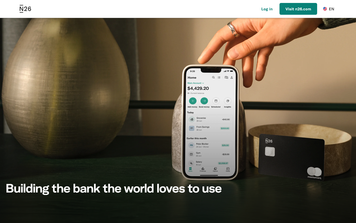
N26
NeobankN26 embodies sophisticated financial minimalism through its signature teal accent against warm, earthy neutrals and extended typography. The brand communicates approachable premium banking with a distinctly European sensibility - confident yet understated, using natural textures and premium materials to convey trustworthy innovation.
Design Identity
Signature Color
N26 Teal
#088177
Progressive financial trust - modern banking that's both reliable and forward-thinking
Visual Identity
The distinctive combination of warm cream/beige backgrounds with strategic teal accents, paired with the custom N26-Extended typeface and sophisticated material photography featuring natural textures like ceramics and wood.
Component Style
Subtle, rounded corners (approximately 12-16px) with minimal shadows and clean borders. Interactive elements use gentle teal fills with white text, maintaining an organic, approachable feel rather than sharp corporate edges.
Spacing Philosophy
Generous breathing room with asymmetrical layouts that feel natural rather than grid-locked. Large negative space areas create premium feel while maintaining warmth through organic material photography.
Design Principles
- Teal (#088177) is reserved exclusively for primary actions and key highlights
- Typography uses custom N26-Extended for headers with consistent 400 weight
- Border radius stays between 12-16px for friendly approachability
- Warm neutrals (#faf8f5, #f2f2f2) dominate backgrounds over pure white
- Material photography features natural textures and warm lighting
Target Audience
Design-conscious millennials and Gen-Z professionals who value aesthetic sophistication in their financial tools and prefer European minimalism over Silicon Valley tech aesthetics
Mood
Design descriptions are AI-generated based on visual analysis and may not fully reflect the brand's official design guidelines.
Design System
Typography Scale
| Element | Font | Size | Weight | Line Height |
|---|---|---|---|---|
| body | 16px | 400 | 24px | |
| h1 | 48px | 400 | 57.6px | |
| h2 | 44px | 400 | 52.8px | |
| h3 | 18px | 400 | 27px | |
| a | 18px | 400 | 27px | |
| button | 18px | 400 | 27px | |
| nav | 18px | 400 | 27px | |
| header | 18px | 400 | 27px | |
| footer | 18px | 400 | 27px | |
| main | 18px | 400 | 27px |
Color Palette
#99424b#d8edeb#d9d9d9#7d3940#ffffff#e9e9e9#6d6d6d#005451#1b1b1b#faf8f5#f2f2f2#056b63