Help us build this. Leave comments, suggest improvements, and help create better design documentation for agents.
Mytheresa
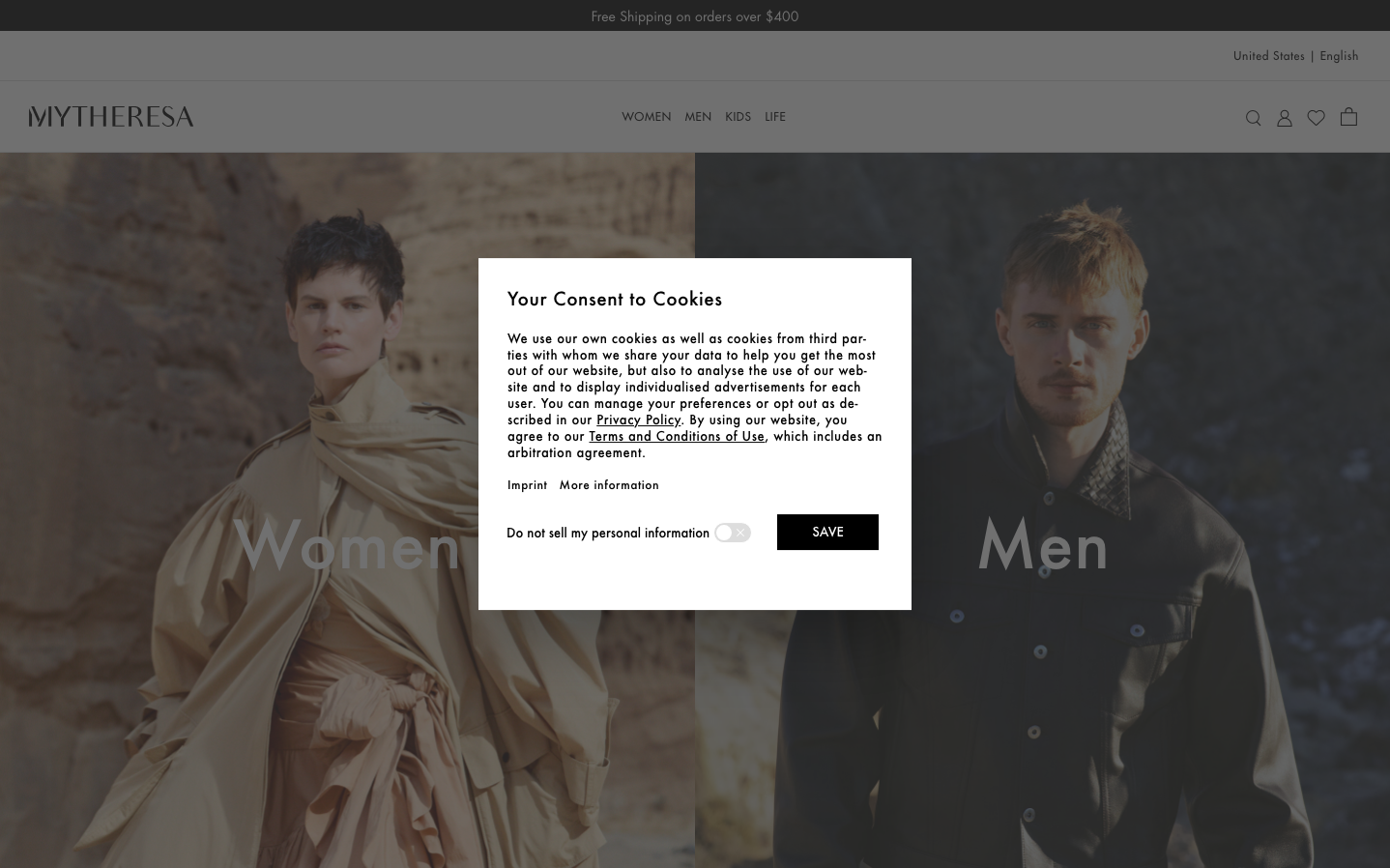
FashionMytheresa embodies editorial luxury through stark minimalism and Futura's geometric precision. The monochromatic palette creates museum-like sophistication while the split-screen composition treats fashion like fine art, targeting discerning luxury consumers who value curation over abundance.
Design Identity
Signature Color
Editorial Black
#000000
Timeless luxury authority and curatorial sophistication
Visual Identity
The dramatically split hero layout with oversized serif category labels ('Women'/'Men') creating editorial magazine-style impact through pure typographic hierarchy.
Component Style
Invisible UI with borderless buttons and text-only navigation. Elements appear weightless against photographic backgrounds, letting typography and imagery dominate without visual interference.
Spacing Philosophy
Generous negative space creates breathing room around hero imagery, while navigation elements cluster tightly in the header. The layout prioritizes dramatic visual impact over information density.
Design Principles
- Typography mixing: Futura geometric sans for headings, Times serif for body text
- Color restraint: Pure black, white, and natural image tones only
- Borderless components with minimal visual weight
- Photography-first layout with text overlays
- Split-screen compositions for category navigation
Target Audience
Affluent fashion connoisseurs who shop luxury as lifestyle curation rather than impulse purchasing
Mood
Design descriptions are AI-generated based on visual analysis and may not fully reflect the brand's official design guidelines.
Design System
Typography Scale
| Element | Font | Size | Weight | Line Height |
|---|---|---|---|---|
| body | 16px | 400 | 16px | |
| h1 | 20px | 400 | 26px | |
| h2 | 20px | 400 | 26px | |
| p | 12px | 400 | 15.6px | |
| a | 14.08px | 400 | 14.08px | |
| input | 16px | 400 | 22.4px |
Color Palette
#007aff