Help us build this. Leave comments, suggest improvements, and help create better design documentation for agents.
Monzo
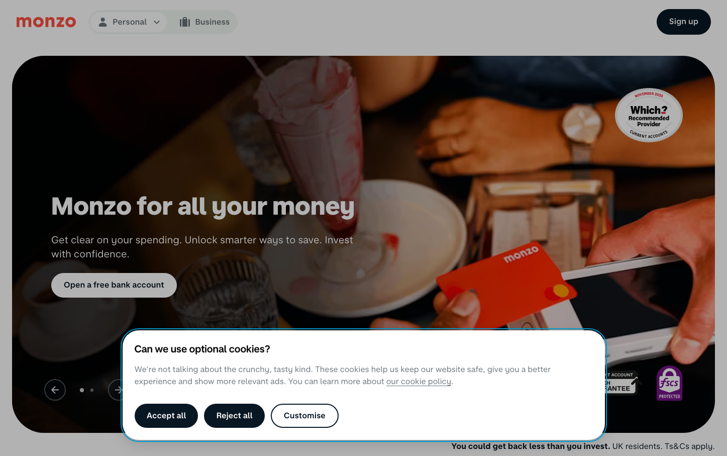
NeobankMonzo's brand radiates warmth through its signature coral-orange card contrasted against moody, intimate photography. The custom MonzoSans typography feels approachable yet confident, while the lifestyle imagery creates an emotional connection around everyday financial moments.
Design Identity
Signature Color
Monzo Coral
#FF6B47
Accessible warmth that humanizes banking - energetic yet trustworthy
Visual Identity
The distinctive coral-orange debit card prominently featured in warm, contextual lifestyle photography with generous white space and understated typography hierarchy.
Component Style
Soft, approachable buttons with generous rounded corners (24px+) and substantial padding. No harsh shadows or borders - everything feels tactile and friendly with muted backgrounds that let the coral brand color pop.
Spacing Philosophy
Generous breathing room with large hero sections and ample whitespace around key messaging. Compact internal spacing keeps components intimate while macro spacing creates calm, uncluttered layouts.
Design Principles
- Coral brand color only appears on card and key brand moments
- Typography uses custom MonzoSans with 800 weight for headlines, 400 for body
- Rounded corners on all interactive elements exceed 20px
- Photography always shows real-world context, never stock poses
- White text over dark photography for hero messaging
Target Audience
Millennials and Gen Z seeking a bank that understands their digital-first lifestyle without sacrificing human connection
Mood
Design descriptions are AI-generated based on visual analysis and may not fully reflect the brand's official design guidelines.
Design System
Typography Scale
| Element | Font | Size | Weight | Line Height |
|---|---|---|---|---|
| body | 16px | 400 | 22.4px | |
| h2 | 39.0624px | 800 | 46.8749px | |
| h3 | 31.2496px | 800 | 37.4995px | |
| p | 16px | 400 | 22.4px | |
| a | 16px | 400 | 22.4px | |
| button | 16px | 400 | 22.4px | |
| input | 16px | 400 | 17.6px | |
| nav | 16px | 400 | 22.4px | |
| header | 16px | 400 | 22.4px | |
| footer | 16px | 400 | 22.4px |
Color Palette
No colors extracted