Help us build this. Leave comments, suggest improvements, and help create better design documentation for agents.
Monocle
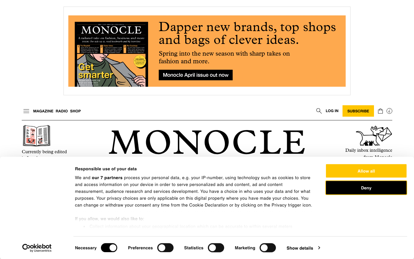
MediaMonocle employs a sophisticated editorial aesthetic that marries classic serif typography with warm, saturated amber tones to evoke premium publishing heritage. The design feels like a luxurious magazine brought to digital life, with stark black accents creating authoritative contrast against creamy neutrals.
Design Identity
Signature Color
Monocle Amber
#FFD700
premium editorial authority and intellectual sophistication
Visual Identity
The distinctive amber-to-orange gradient backgrounds paired with classical Plantin serif typography create an unmistakable magazine-quality aesthetic that signals premium editorial content.
Component Style
Clean rectangular components with subtle 8px radius corners, no heavy shadows or borders - everything feels crisp and editorial like a well-designed magazine layout with generous whitespace.
Spacing Philosophy
Generous breathing room with 24px base spacing creates a luxurious reading experience, while the layout prioritizes content hierarchy over density - more magazine spread than digital cramming.
Design Principles
- Border radius consistently 8px for subtle softness
- Plantin serif for all headings maintains editorial authority
- Sans-serif body text at 15px for digital readability
- Amber gradients only for hero sections and key highlights
- Black (#000000) for maximum contrast and authority
Target Audience
Globally-minded creative professionals and cultural tastemakers who value sophisticated journalism and design craft over quick digital consumption
Mood
Design descriptions are AI-generated based on visual analysis and may not fully reflect the brand's official design guidelines.
Design System
Typography Scale
| Element | Font | Size | Weight | Line Height |
|---|---|---|---|---|
| body | 16px | 400 | 24px | |
| h1 | 32px | 400 | 48px | |
| h2 | 32px | 400 | 38.4px | |
| h3 | 20px | 400 | 25px | |
| h4 | 18px | 700 | 23.4px | |
| p | 15px | 400 | 21.66px | |
| a | 15px | 400 | 24px | |
| button | 15px | 700 | 22.5px | |
| input | 15px | 400 | 17.25px | |
| nav | 16px | 400 | 24px |
Color Palette
#7a00df#007cba#006ba1#005a87#ffffff#000000#fdfcf3#e7e7e7#f9f9f9#f0f0f0#d9d9d9#b3b3b3